UMPG Digital Branding

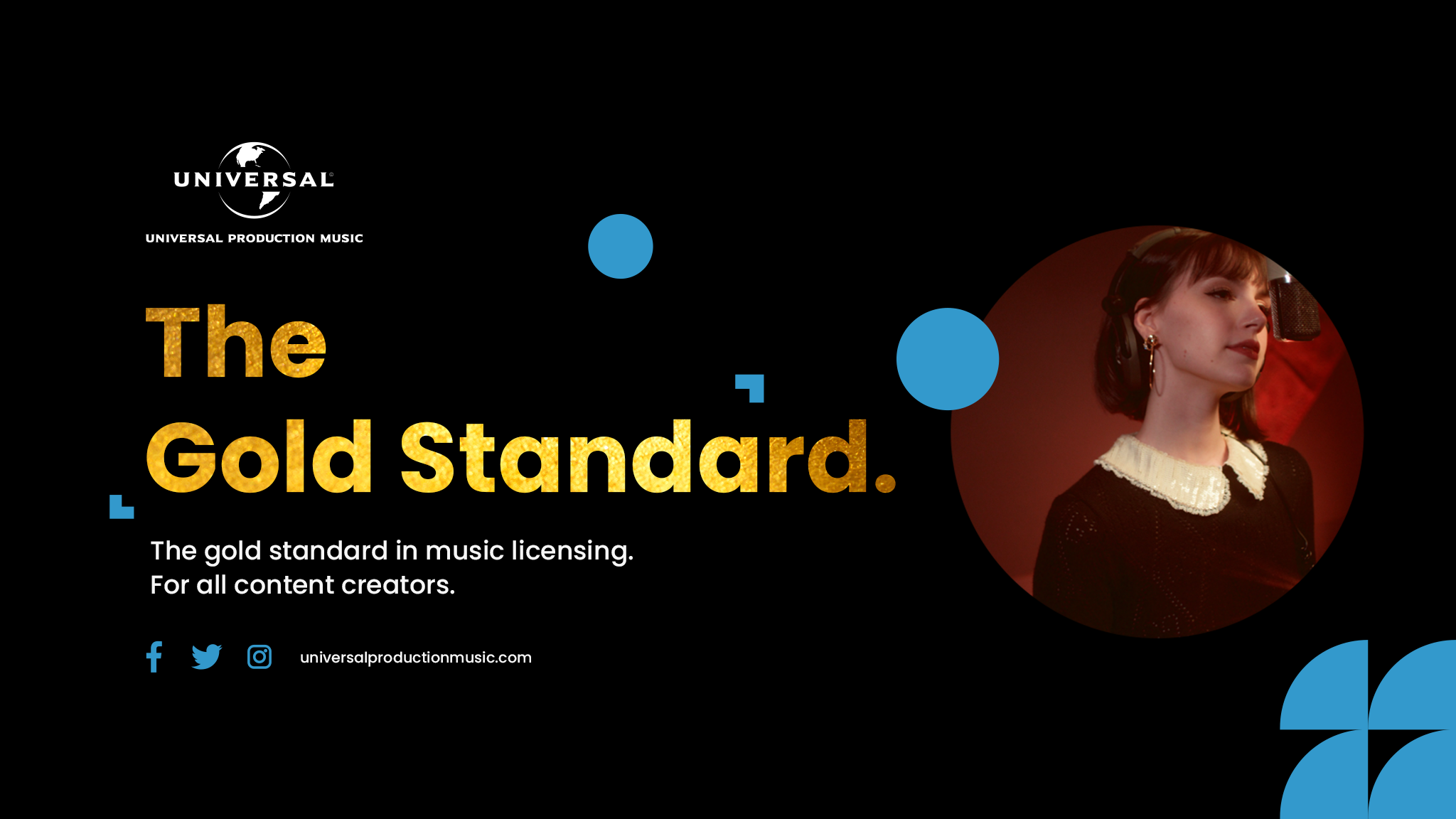
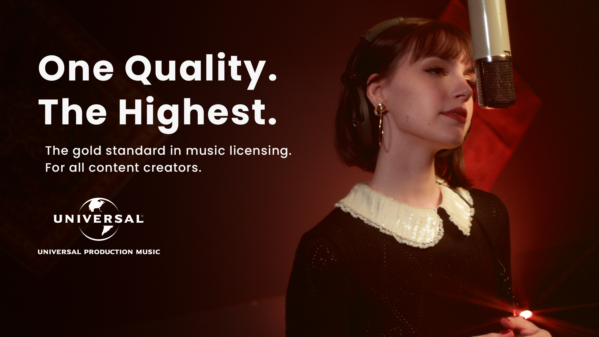
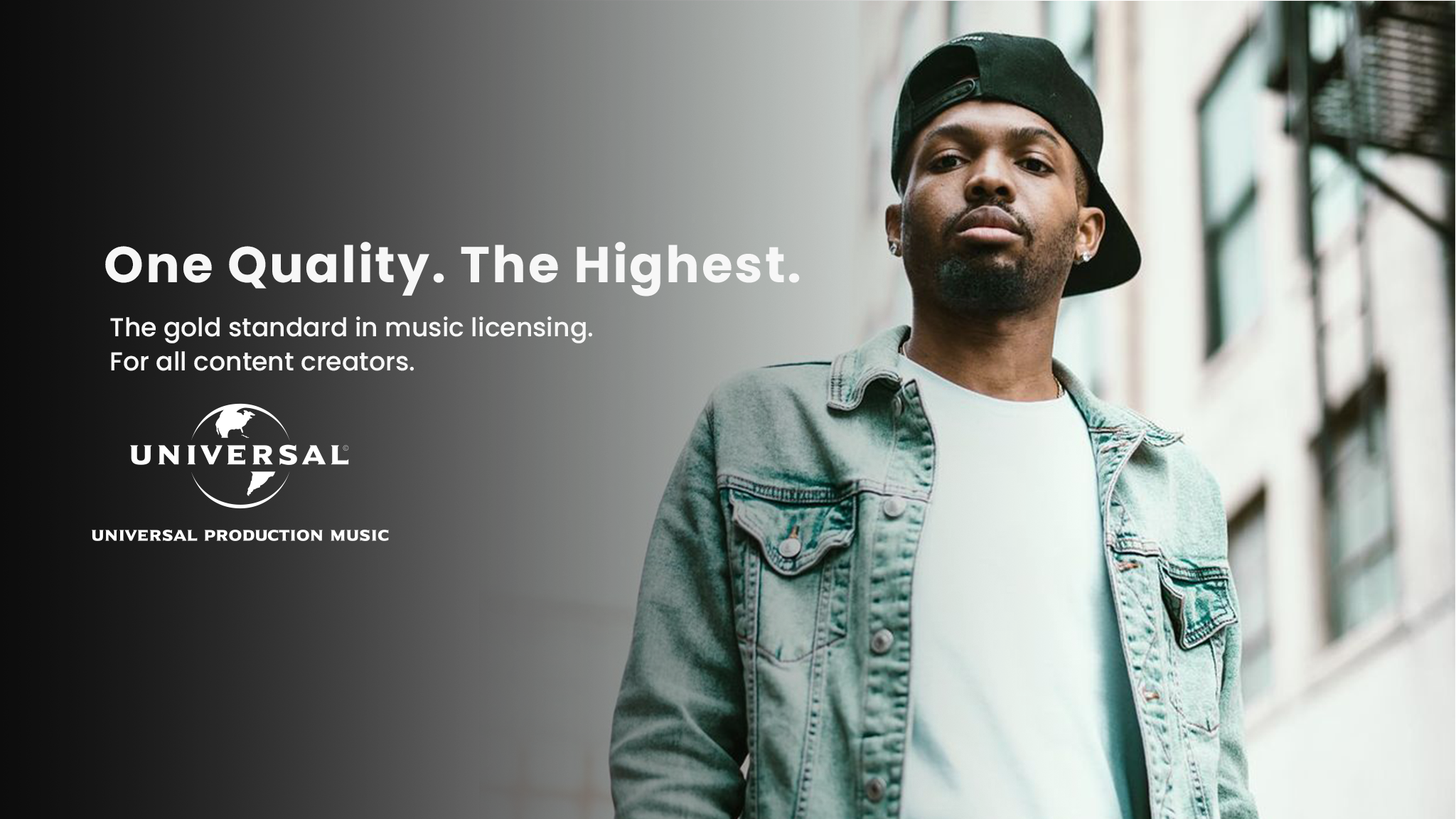
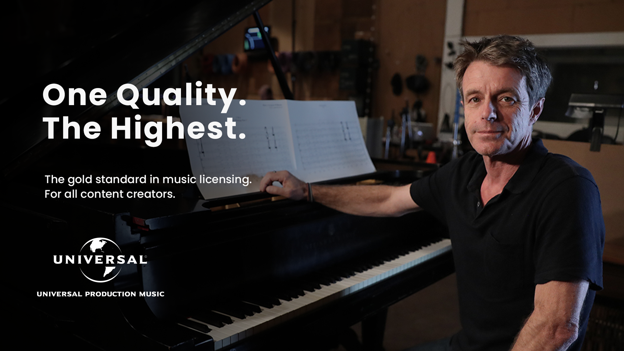
I led the initiative to create and design UMPG’s YouTube and SMM banners for territories internationally to adopt. Leveraging the success of our US channel as the primary website referral source, we strategically applied our content strategy across territories, centralizing UMPG channels. Our goal was to create designs that could be seamlessly translated both linguistically and graphically, with a special focus on promoting local artists. The selected imagery was then adapted for use in website hero sections, a project I managed through Sitecore CMS. This effort significantly improved key digital marketing KPIs, bolstering brand visibility and engaging a global audience while preserving our brand identity.

Task

Lead the creation and design of UMPG's YouTube and SMM banners, spearheading a successful international brand re-fresh initiative, centralizing channels, enhancing localization, and improving brand visibility.
  • Strategy

    Brand Strategy, UI/UX Strategy

  • Design

    UI/UX Design, Art Direction

  • Client

    Universal Music Publishing Group

Open Project

Artist

Expression

Tracing the roots
to bring the
authentic details
and combine it with
a private intimate
residence.

Nestled on the breathtaking island of Mallorca, this beautiful studio showcases the epitome of coastal sophistication and timeless elegance. Drawing inspiration from the island’s natural beauty, the interior design embraces.

As you step inside, the studio welcomes you with a light and airy atmosphere, courtesy of floor-to-ceiling windows that frame panoramic views of the azure sea and rugged cliffs.

We’re a team of creatives who are excited about unique ideas and help fin-tech companies to create amazing identity by crafting top-notch UI/UX.

Let's Collaborate

Got a project?

We’re a team of creatives who are excited about unique ideas and help fin-tech companies to create amazing identity by crafting top-notch UI/UX.

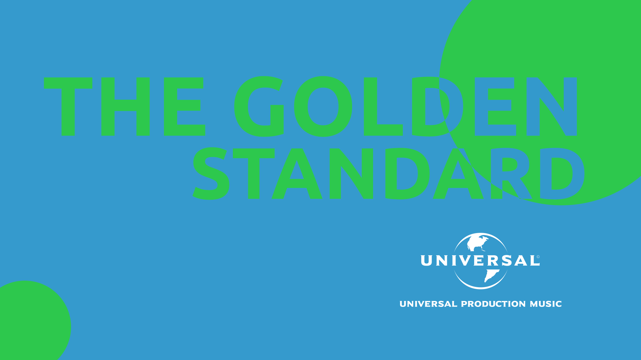
Concept 1

Headline & color exploration

This concept explored our brand guidelines’ color palette, strategically incorporating the spectrum of hues that not only resonated with our brand identity but also created a cohesive visual language. The integration of spheres harmonizes with our logo, adding an extra layer of depth and symbolism to our visual storytelling. These spheres were more than just design elements; they were metaphors for our brand’s all-encompassing and connected presence in the digital realm, encapsulating the diversity and inclusivity of our offerings. 

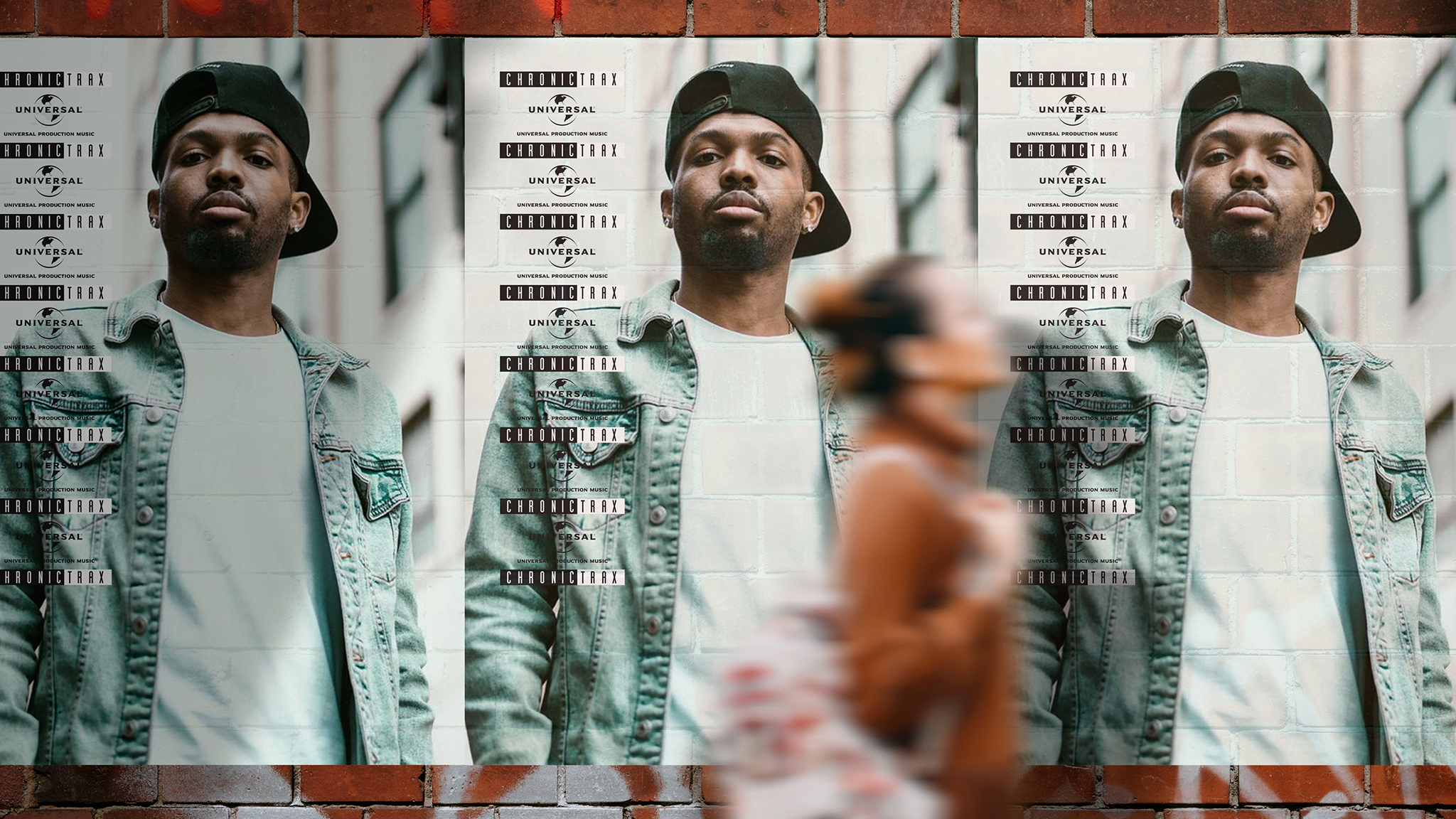
Concept 2

Urban Artist

This urban poster concept plays off of a traditional form of advertising: wheat-pasting posters onto street facades. This artistic vision allows us to adapt the posters to any artist or project with different wall and passer-by iterations for continous but fresh imagery while harnessing the energy of the streets.

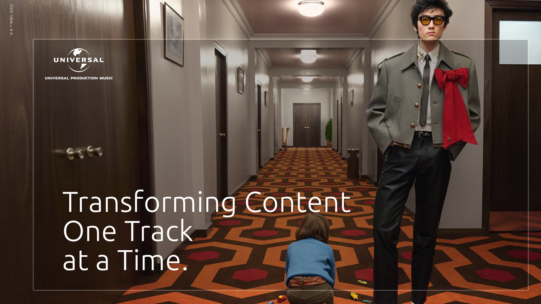
Concept 3

Co-Branded Project

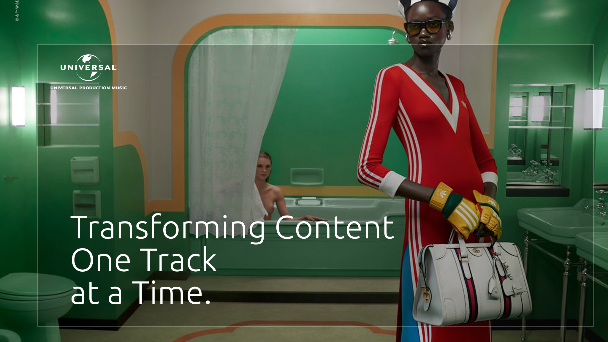
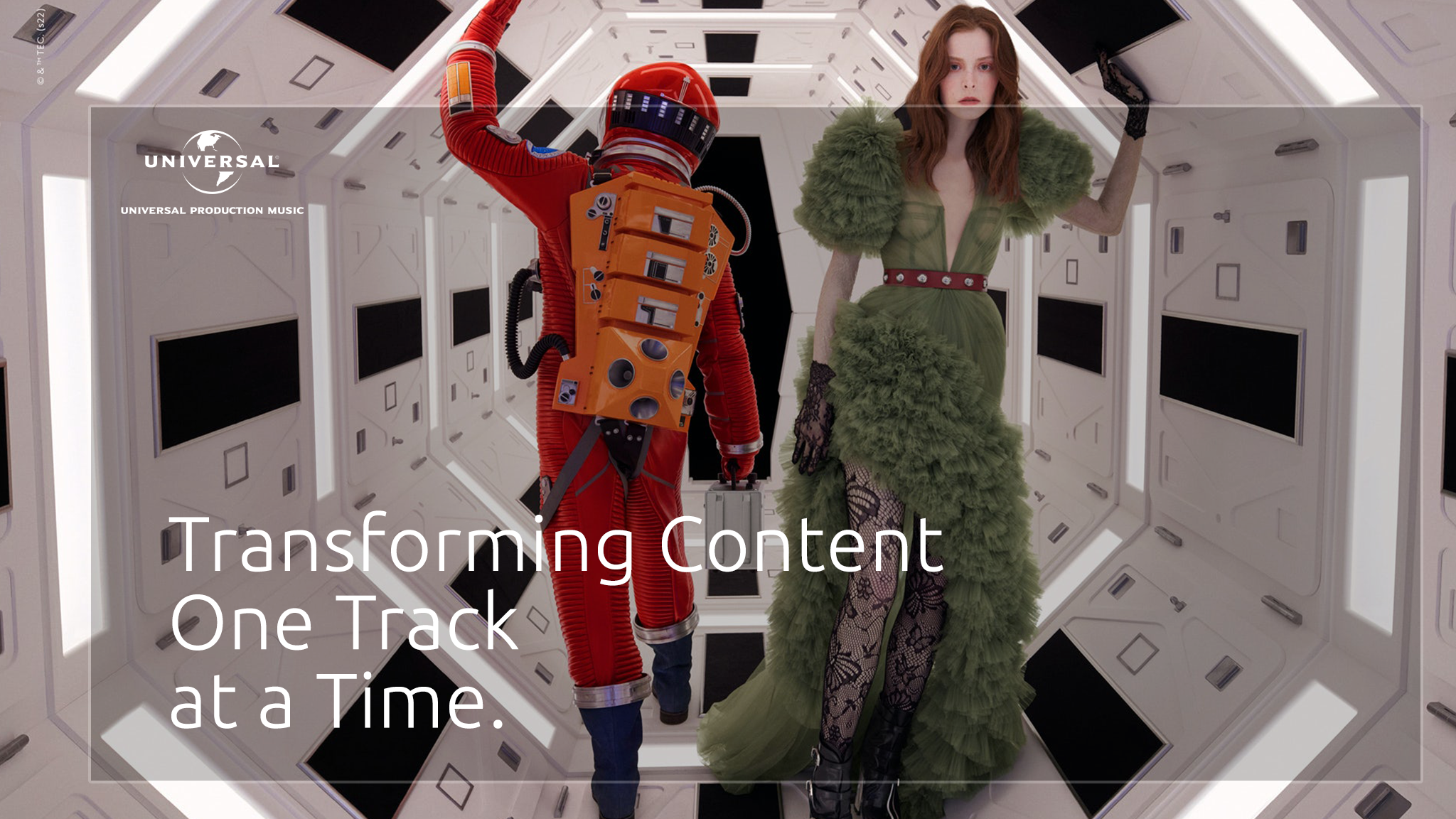
Utilizing projects, advertisements, and productions creatives with Universal music licenses showing how our content can and is being used in transformative ways. This concept is also adaptable to territories projects and has evergreen qualities.

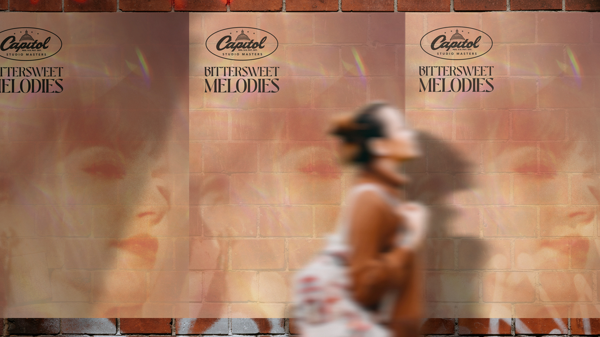
Concept 4

Artist Highlights

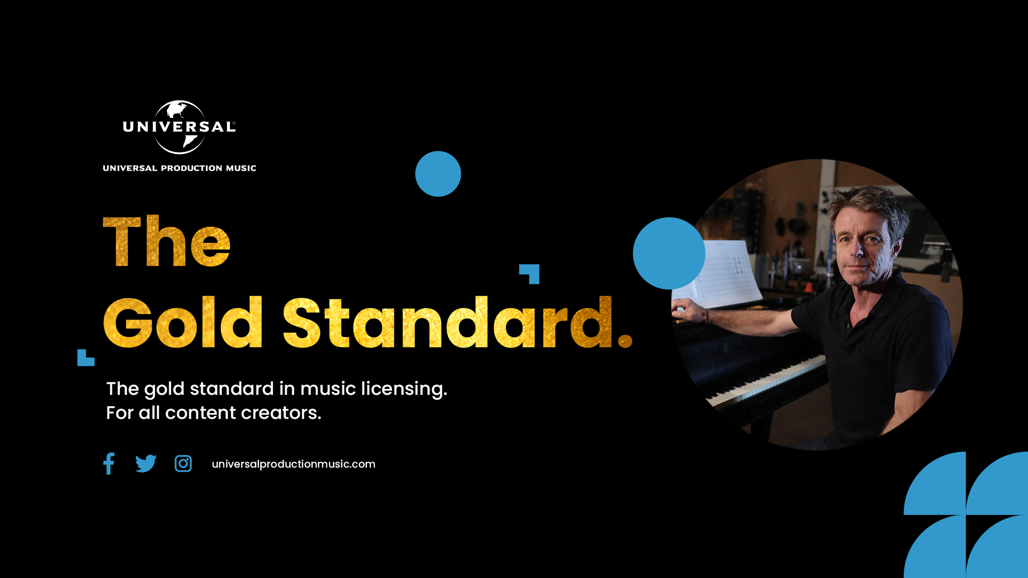
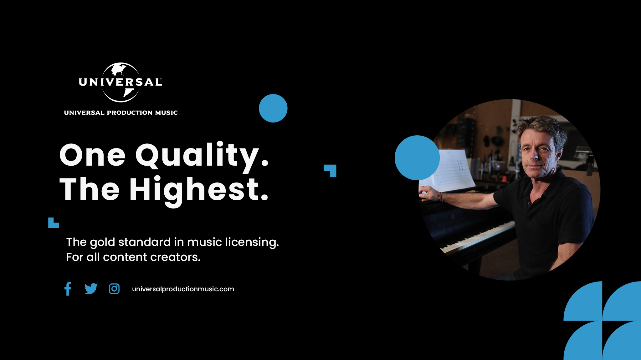
Playing with a few new tagline concepts i pitched to executives, i incorporated various current artists and projects that can be adapted to each territory as new projects and artist initiatves emerge with the same branding and headlining. The colors play within the brand guidelines while incorporating new graphics matching the “Gold Standard” concept. 

Concept 5

Texture

A safer collection of concepts mostly intended to give the creative context and support to let the other concepts shine. These of course portray to a possibly older demographic of key stakeholders. Each gradient or element has a musical tie that had variations and iterations within itself for varying territories and channels. 

Back