Brand & Art Direction October 20, 2026

4L Data brand system

4L Data is a healthcare AI company that screens providers and claims for fraud before payment. I built its marketing brand as a system that holds without me in the room: two typefaces, three colors with jobs, a signature mark, and six AI skills that keep every deck, document, spreadsheet, report and email on standard. The first pass removed more than 4,000 font substitutions from the master deck.

Task

Give a one-person marketing function a brand that every deck, document and report can follow without a designer reviewing each one.
  • Strategy

    Brand Systems, AI Enablement

  • Design

    Identity, Typography, Templates

  • Client

    4L Data

The 4L Data marketing brand as a system: Outfit and DM Sans, three colors with jobs, a signature mark, and six AI skills that keep every deck, document and report on standard.

Client: 4L Data, a healthcare AI company. Scope: the marketing identity, the templates the company works from, and the AI system that enforces both.

My role: Brand lead and sole designer. I set every rule, built every template and wrote the skills that apply them.

Results: One standard across decks, Word, Excel, client reports, email and events. 4,000+ font substitutions removed from the master deck in one pass. 18 design-system components and one font kit for the whole company.

Context

One designer, every format

Everything 4L sends is a document: decks, capability briefs, client reports, spreadsheets of screening results, emails, booth graphics. I was the only designer, and most of those files were made by people who are not designers.

The company ran on a 2020s-era guide set in Myriad Pro, a master deck everyone duplicated, and whatever each machine substituted when the fonts were missing. I kept the old guide’s mission and values and nothing visual. The new brand had to work when I was not in the room.

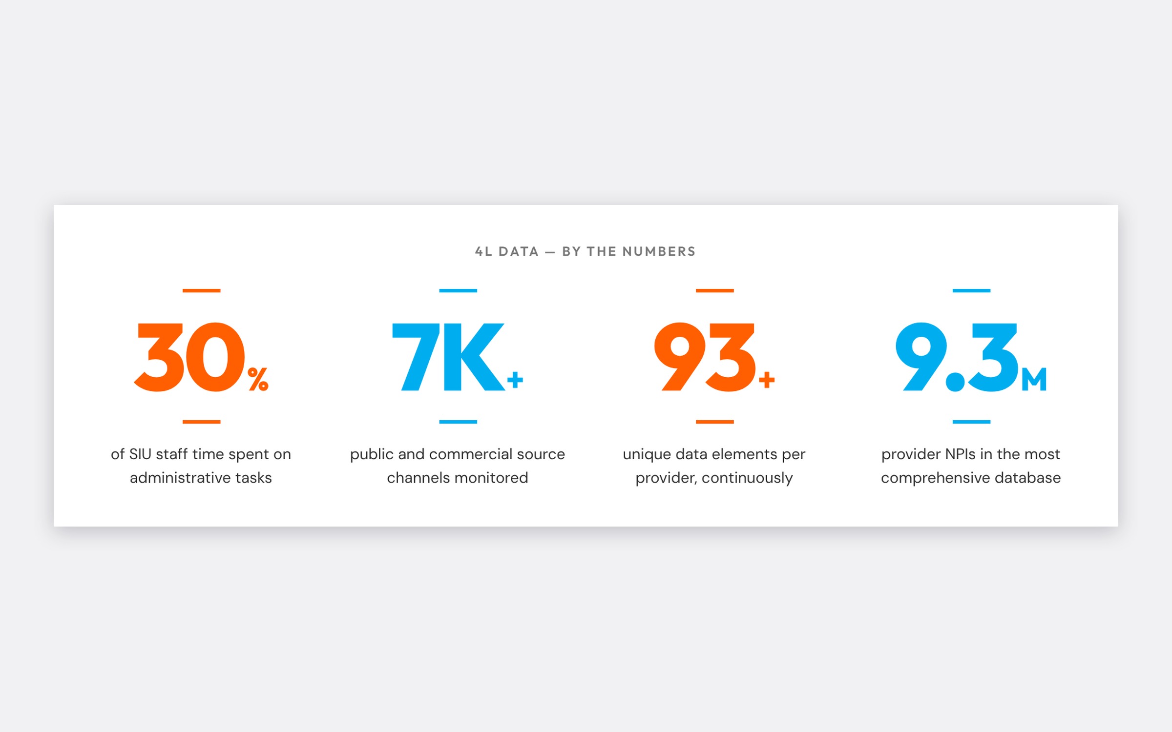
By the numbers

The system

0
Typefaces

Outfit for display, DM Sans for reading. Nothing else in a deck.

0
Brand colors

Navy, orange and cyan, each with one job and written limits.

0
AI skills

Brand, documents, spreadsheets, deck repair, reports and brand ops.

0
Components

Covers, dividers, stat figures, cards, email shell and more.

The mark

A composition, not a logo

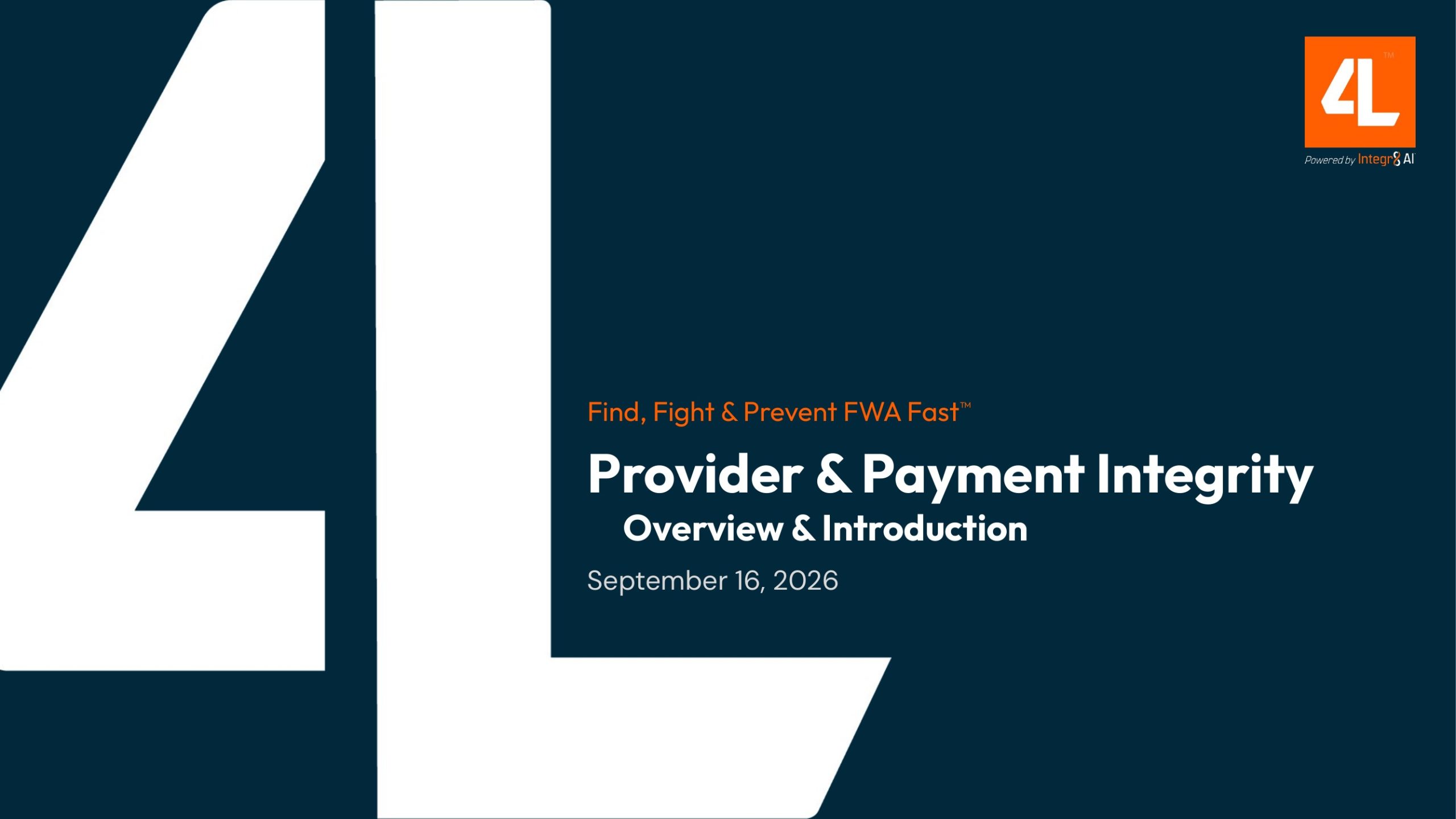
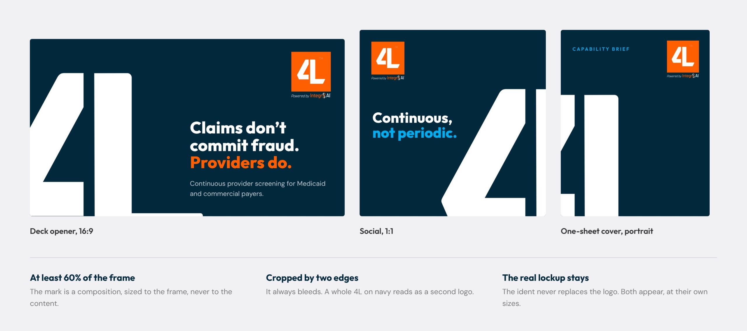
The orange 4L square is the logo. The signature is something else: the white 4L stencil, at least 60 percent of the frame, bleeding off two edges of a navy field, with the real lockup still present at its own size.

It lets a deck opener, a social post and a one-sheet read as the same company before anyone reads a word. The rejected version used the orange square as the big mark, which turned every cover into a second, oversized logo.

The ident across three formats, and the three rules that make it repeatable without a designer.
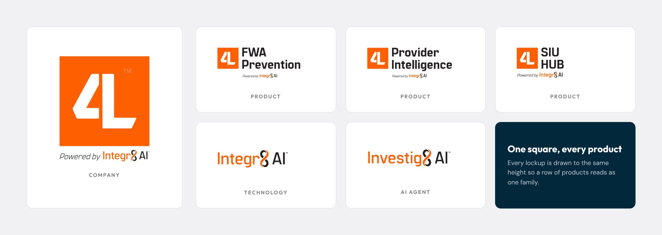
The logo family. Company square, products, the technology and the AI agent, all drawn to one height.
Type and color

Two typefaces, three colors, one job each

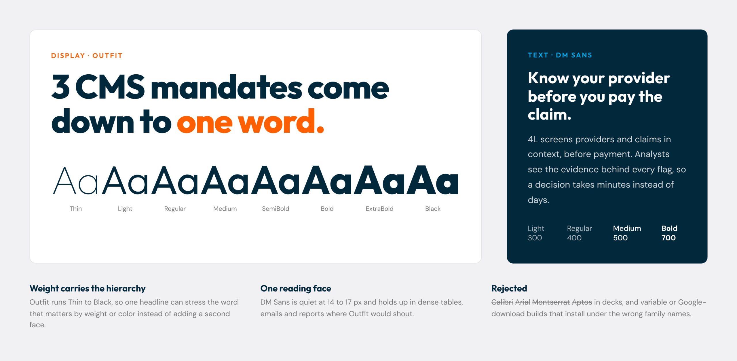
Outfit carries the claim. It runs from Thin to Black, so a headline can stress the word that matters by weight or color instead of reaching for a second face. Thin type reads as weak, so headlines live at Bold and above.

DM Sans carries the proof. It stays quiet at 14 to 17 pixels in tables, emails and reports where Outfit would shout.

Office files stay in Calibri on purpose. Word and Excel travel to machines without the brand fonts, so documents are styled for the font they will actually open in.

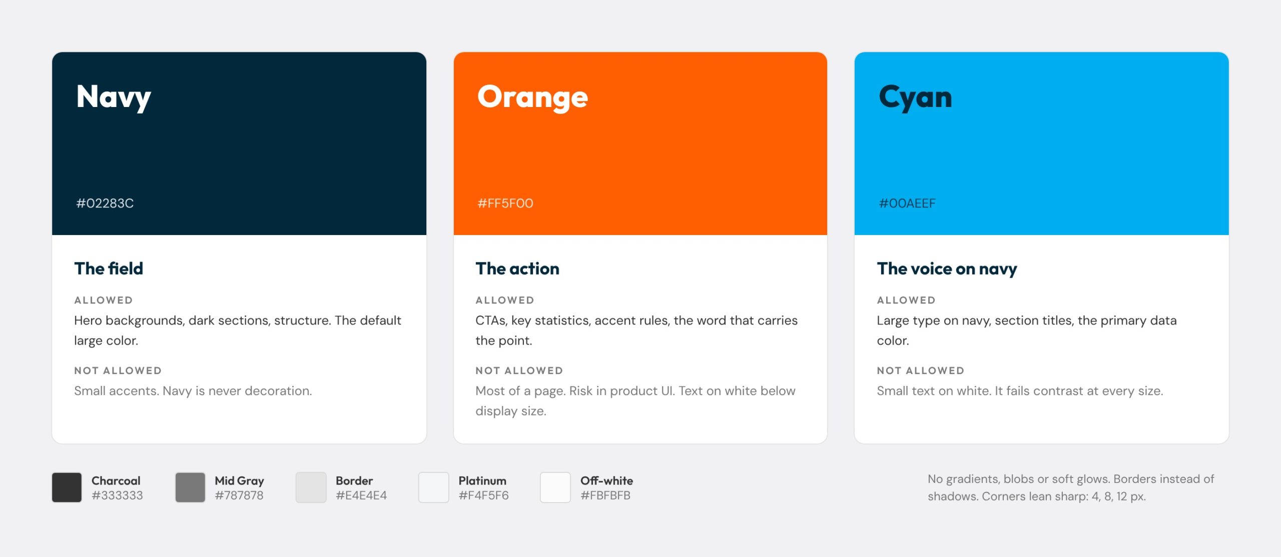
Every color has a job. Navy is the field, orange is the action, cyan is the voice on navy. Each limit comes from contrast: cyan fails as small text on white, so it never appears there.

Rejected: gradients, blobs and soft glows, PowerPoint default blues, and the Google and variable font builds that install under the wrong names and caused most of the substitution damage.

Outfit across its weight range beside DM Sans in running text.
The three brand colors with what each may and may not do, and the neutrals.
The AI system

A brand that enforces itself

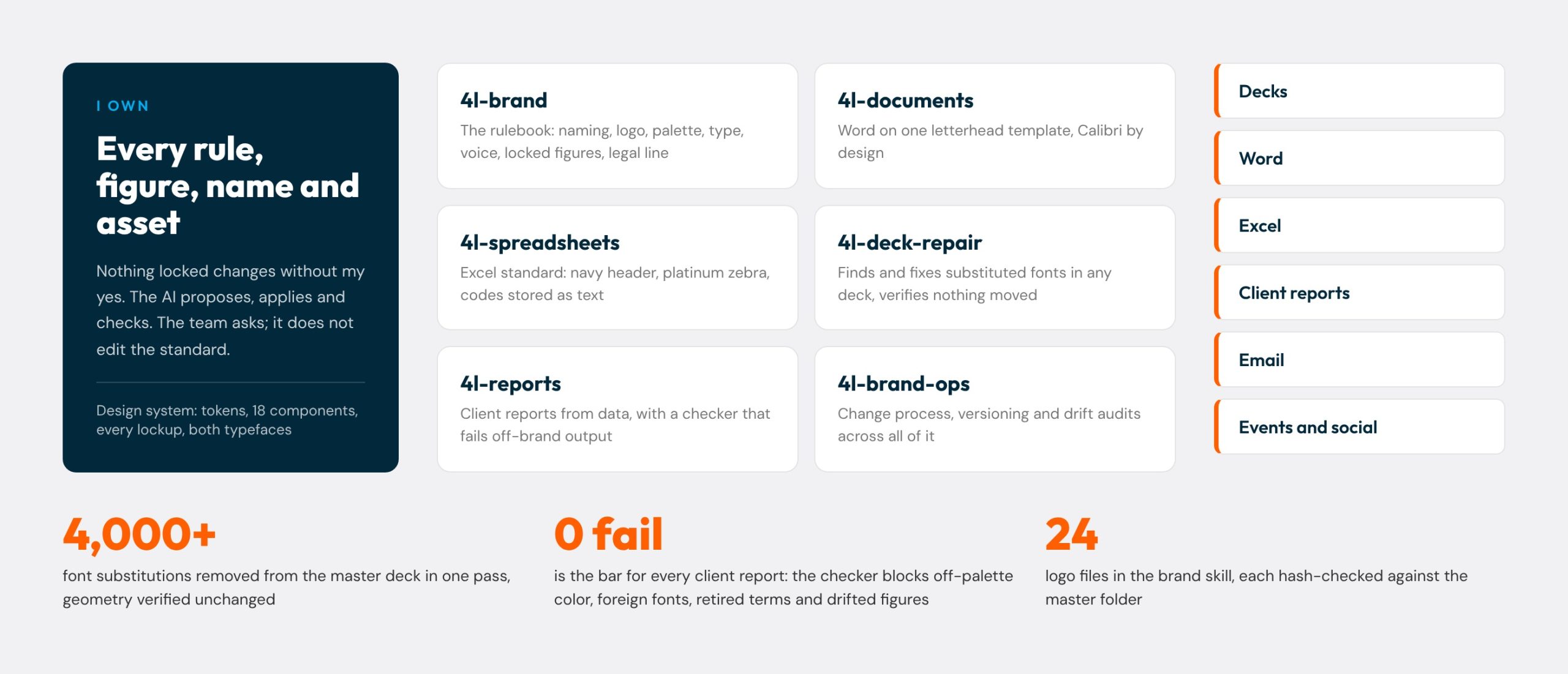
Rules in a PDF get skimmed. So I wrote the brand as six Claude skills that apply it: one rulebook, plus skills for Word, Excel, deck repair, client reports and brand operations, all reading from one design system of tokens, components, lockups and both typefaces.

I own every rule, figure and asset, and nothing locked changes without my approval. The AI applies the rules, runs the checks and proposes changes. The team asks for what they need and gets on-brand files back.

Who owns what, the six skills, and what they produce. The report checker fails any file with an off-palette color, a foreign font, a retired term or a drifted figure.
Templates that scale

Every format, one system

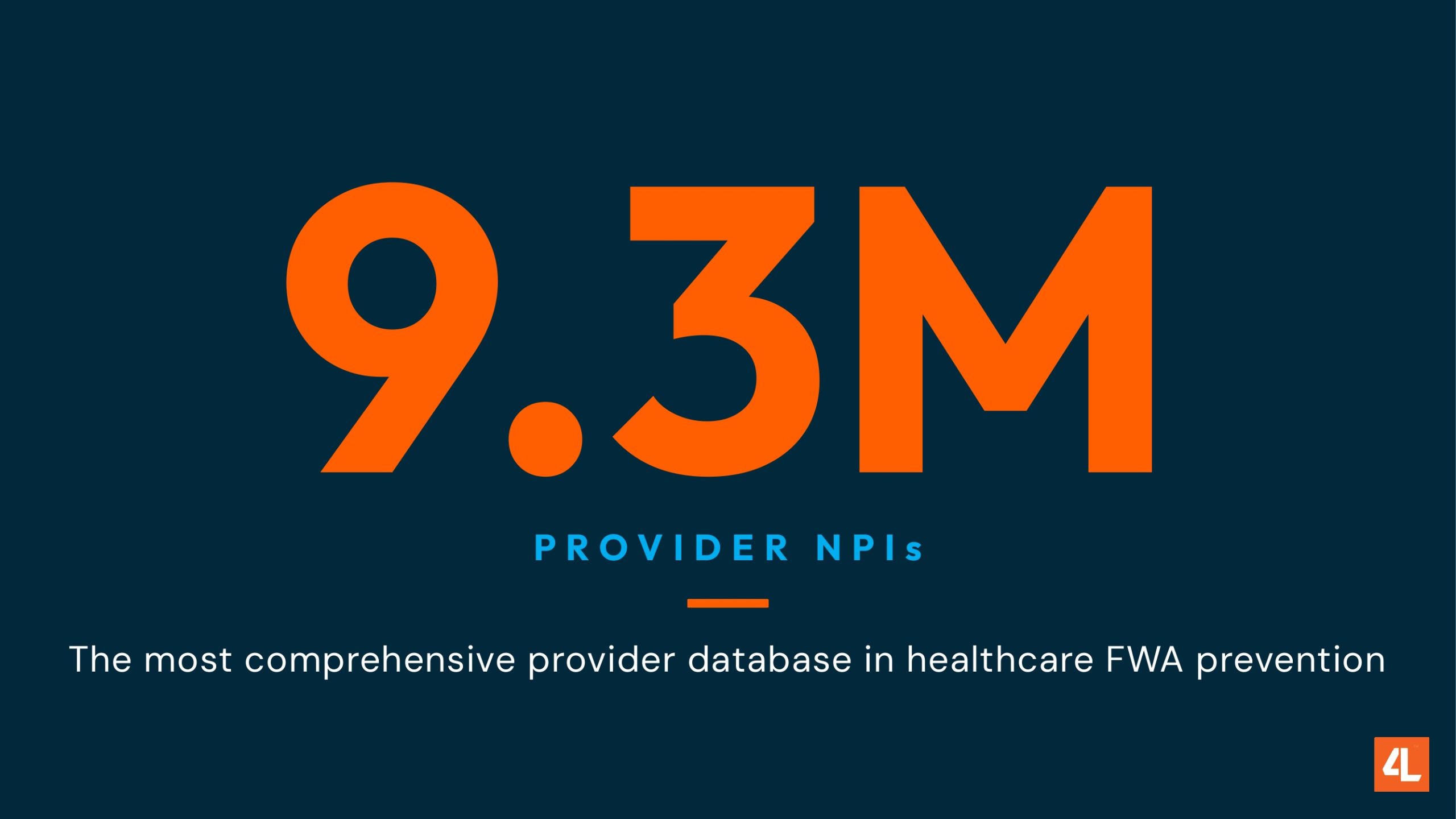
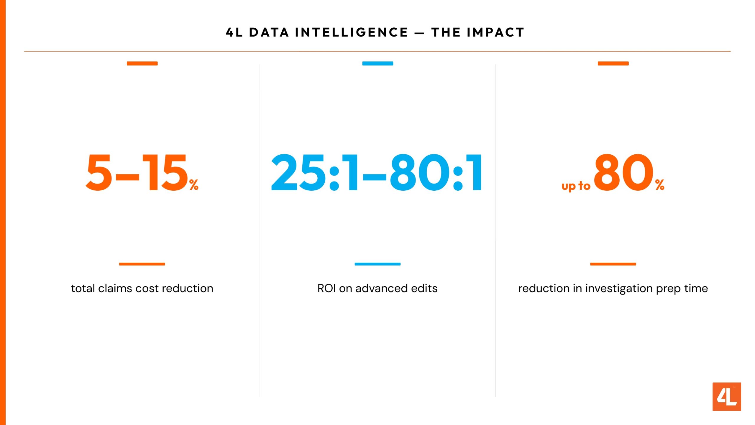
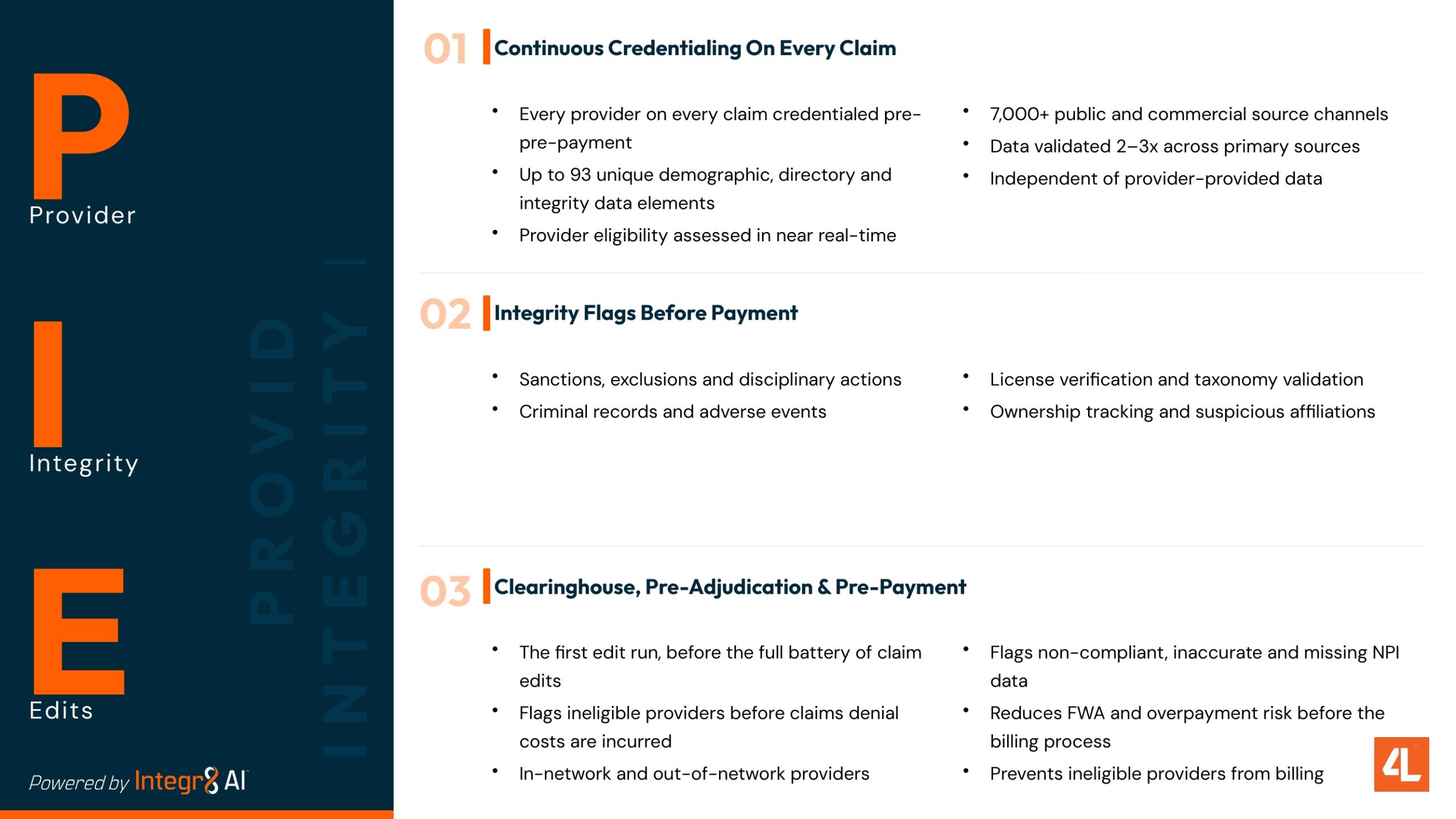
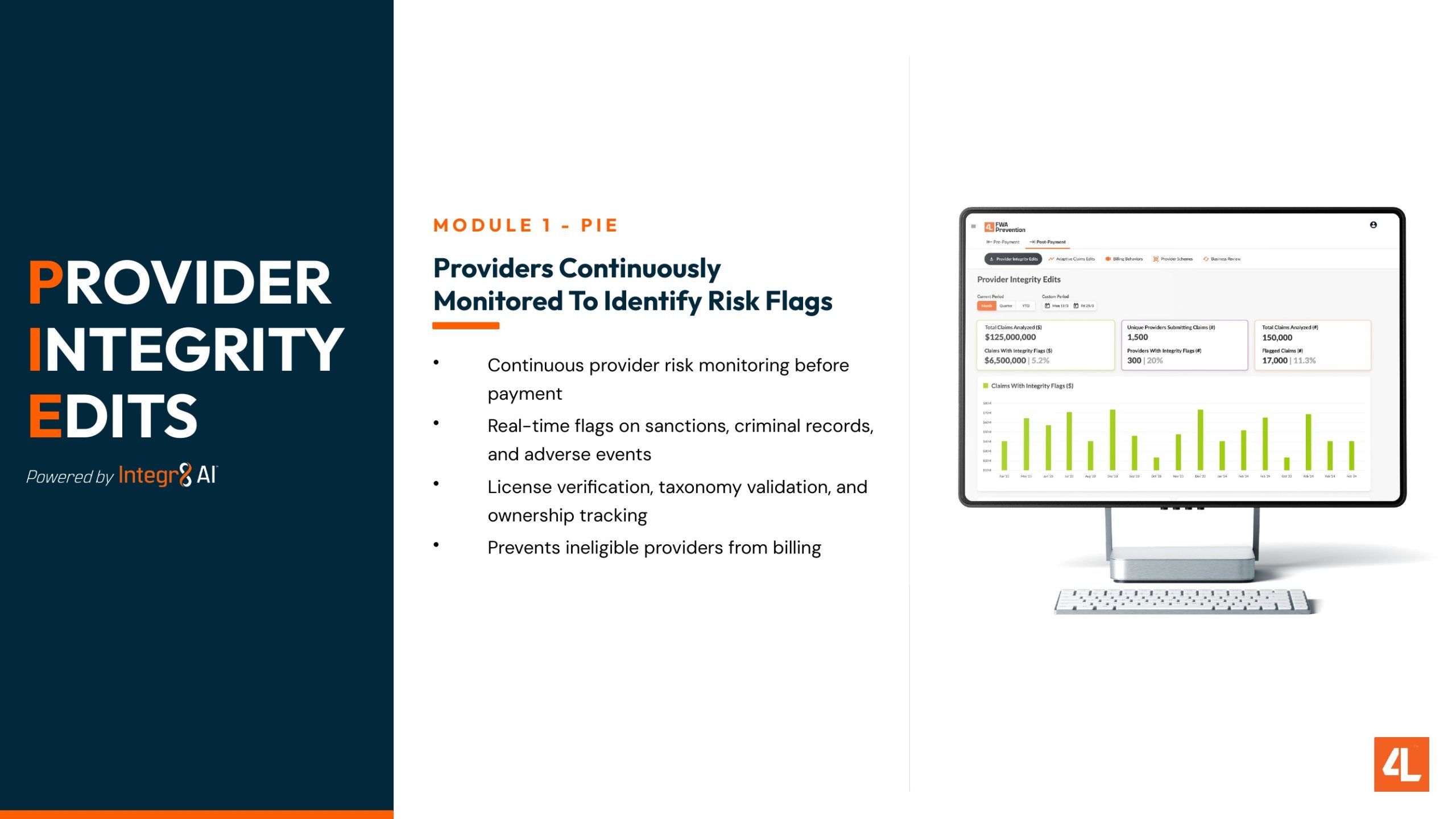
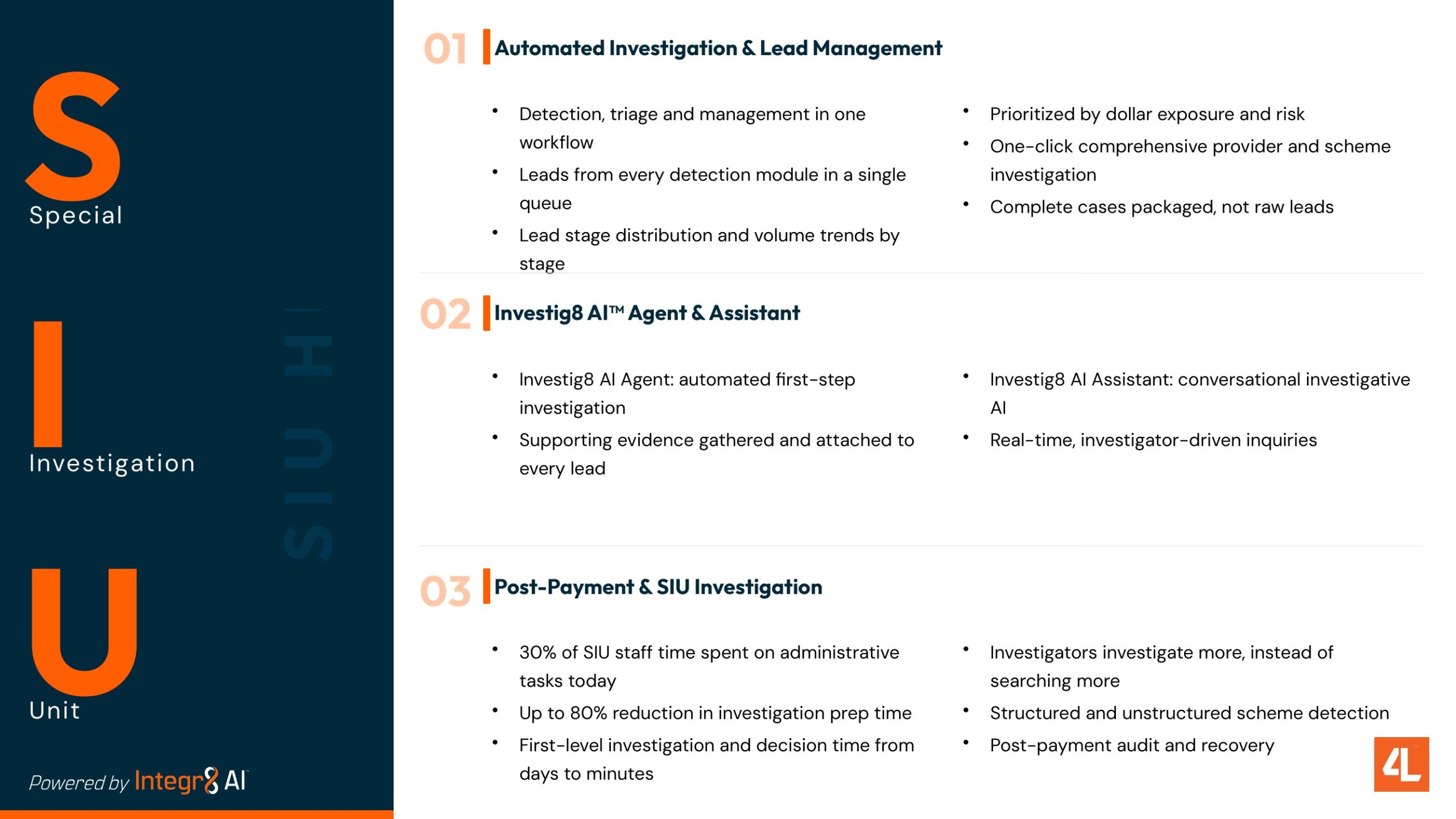
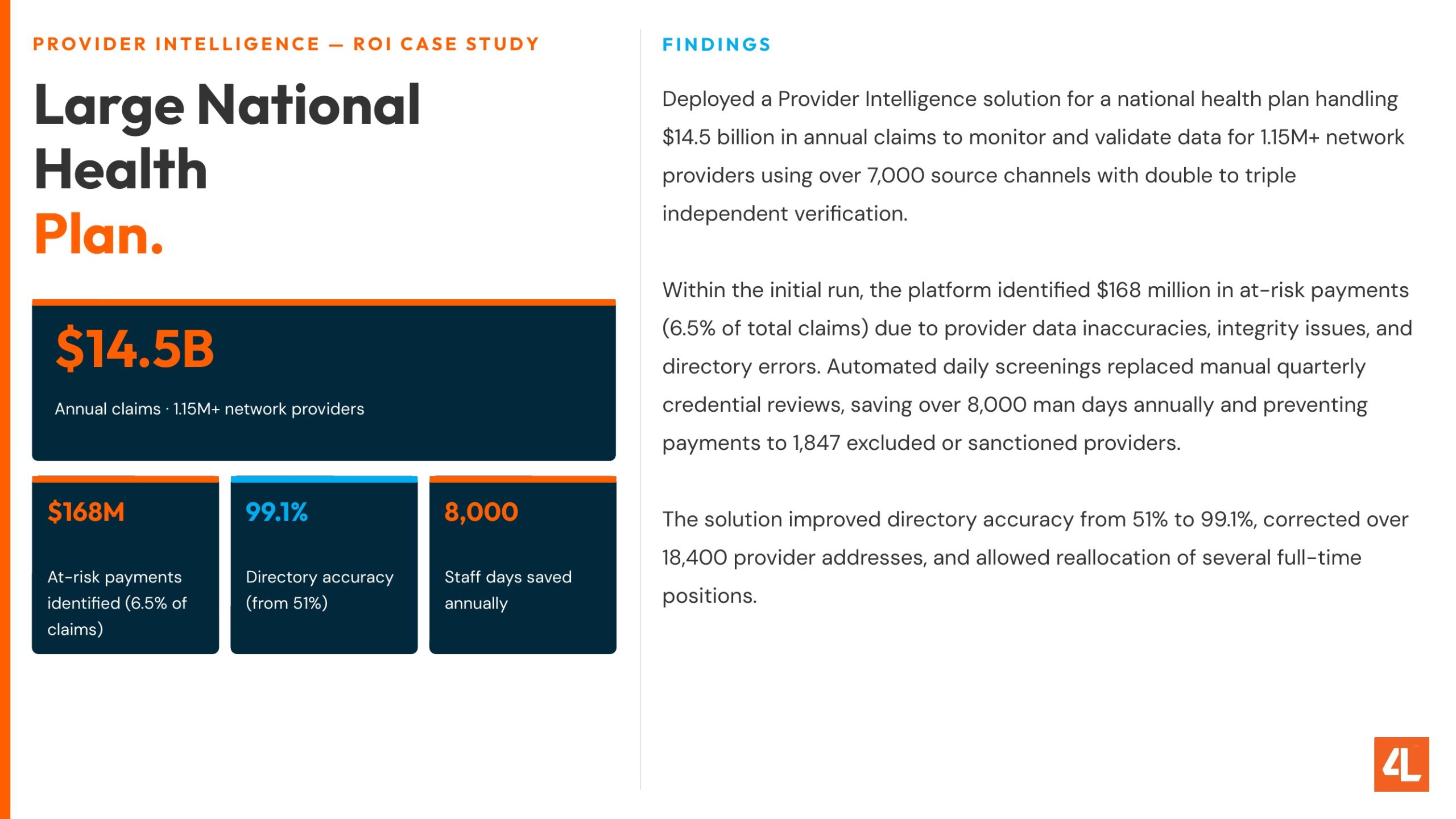
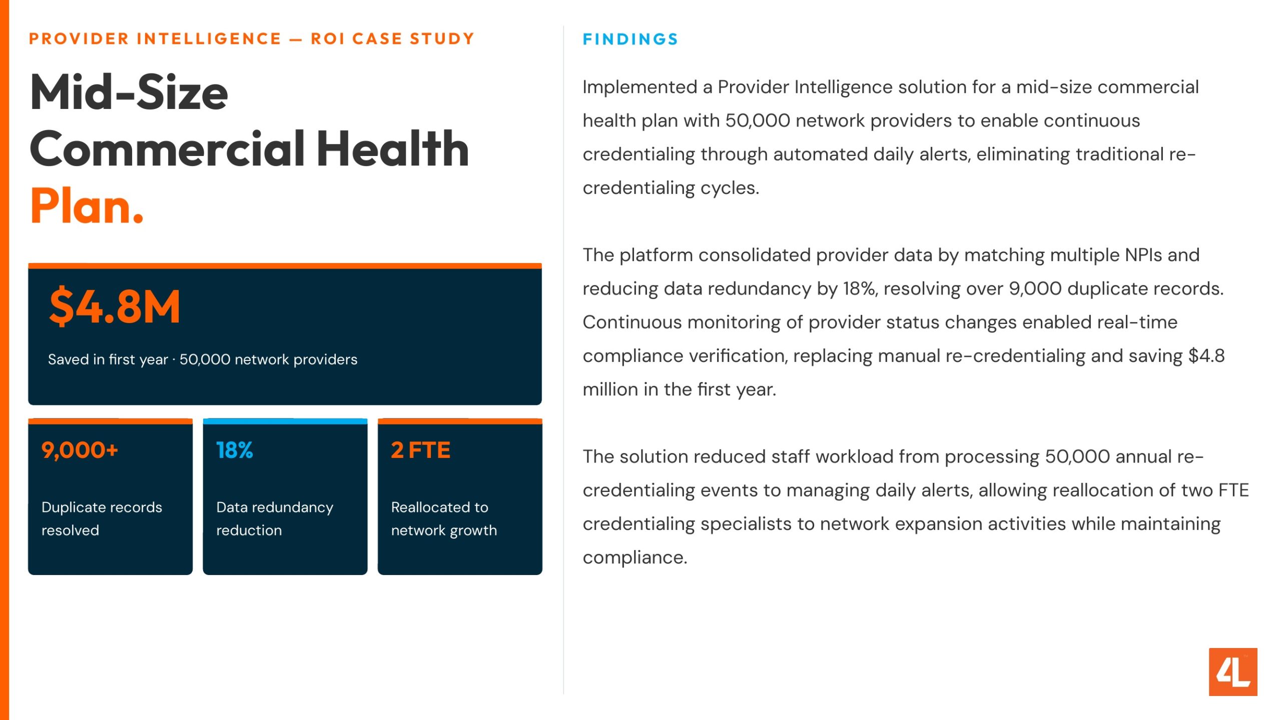
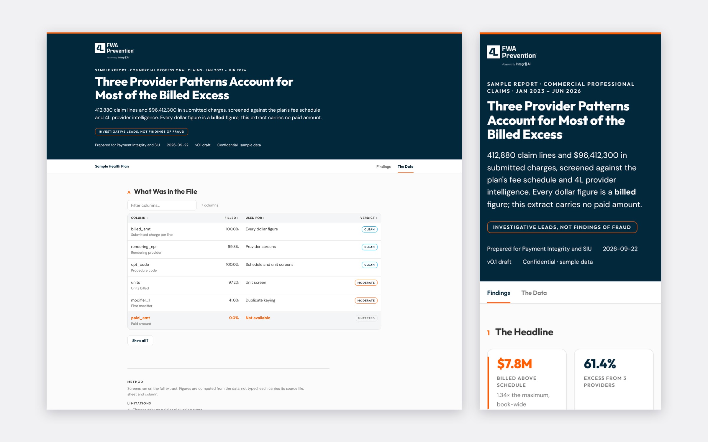
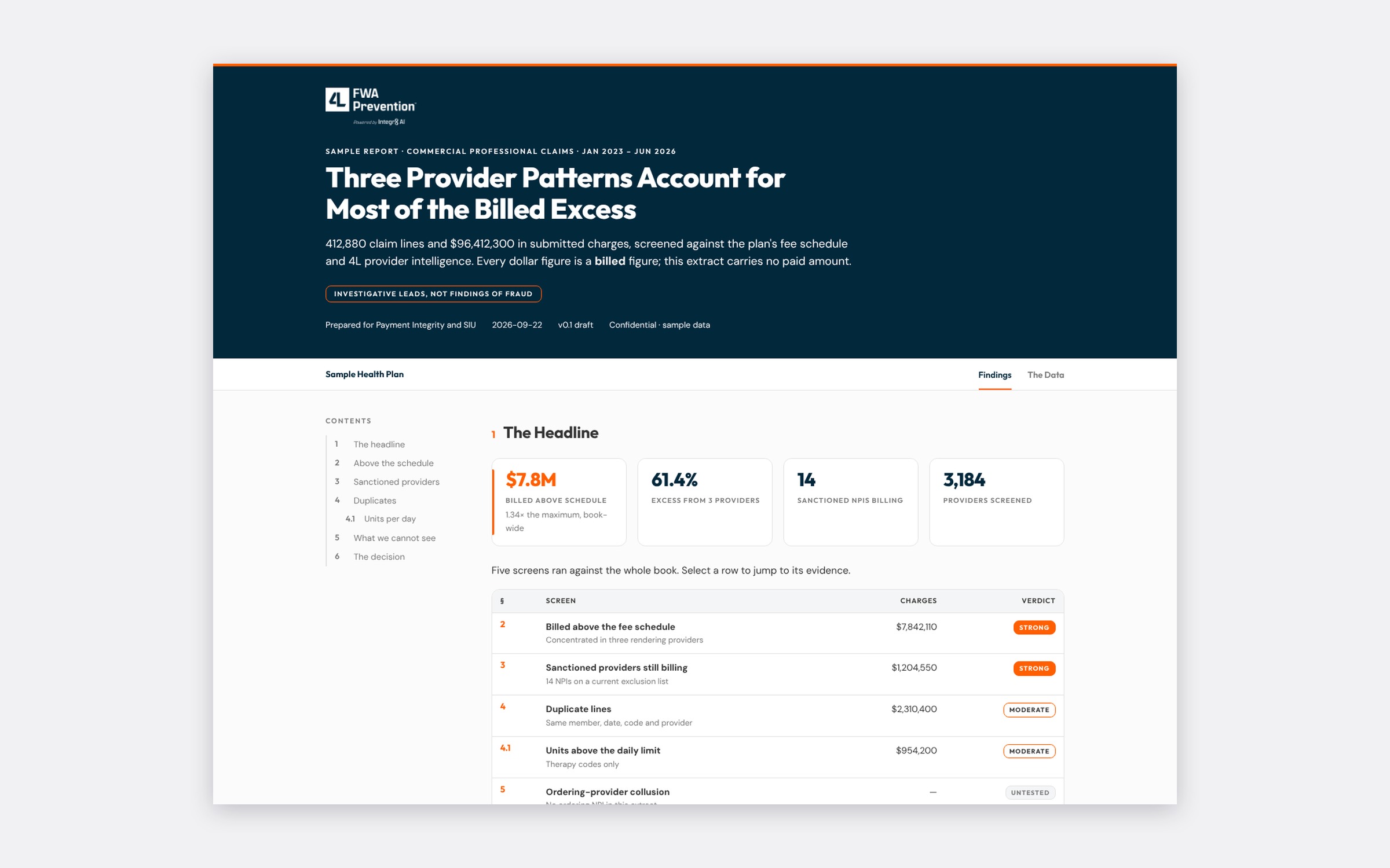
The sales deck, the ROI case studies, client reports, twelve email signatures on desktop and mobile, booth print and social all come from the same rules. The first deck-repair pass removed more than 4,000 font substitutions from the master deck and verified nothing moved.

When a colleague reported tables running off the page in Word Online, the fix went into the documents skill and its template the same day, and every document after it was correct.

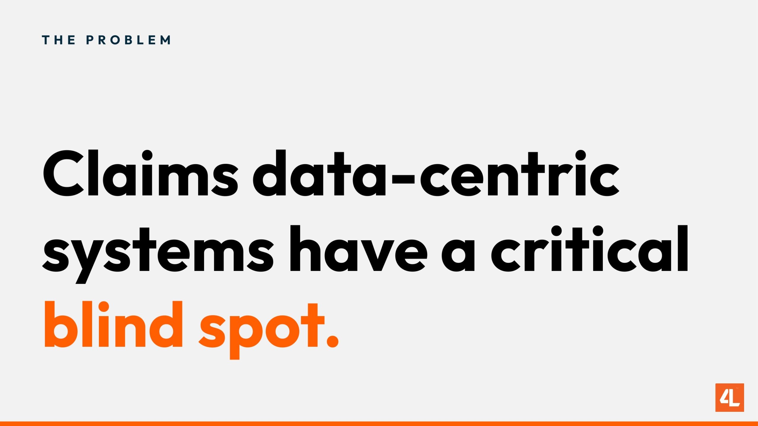
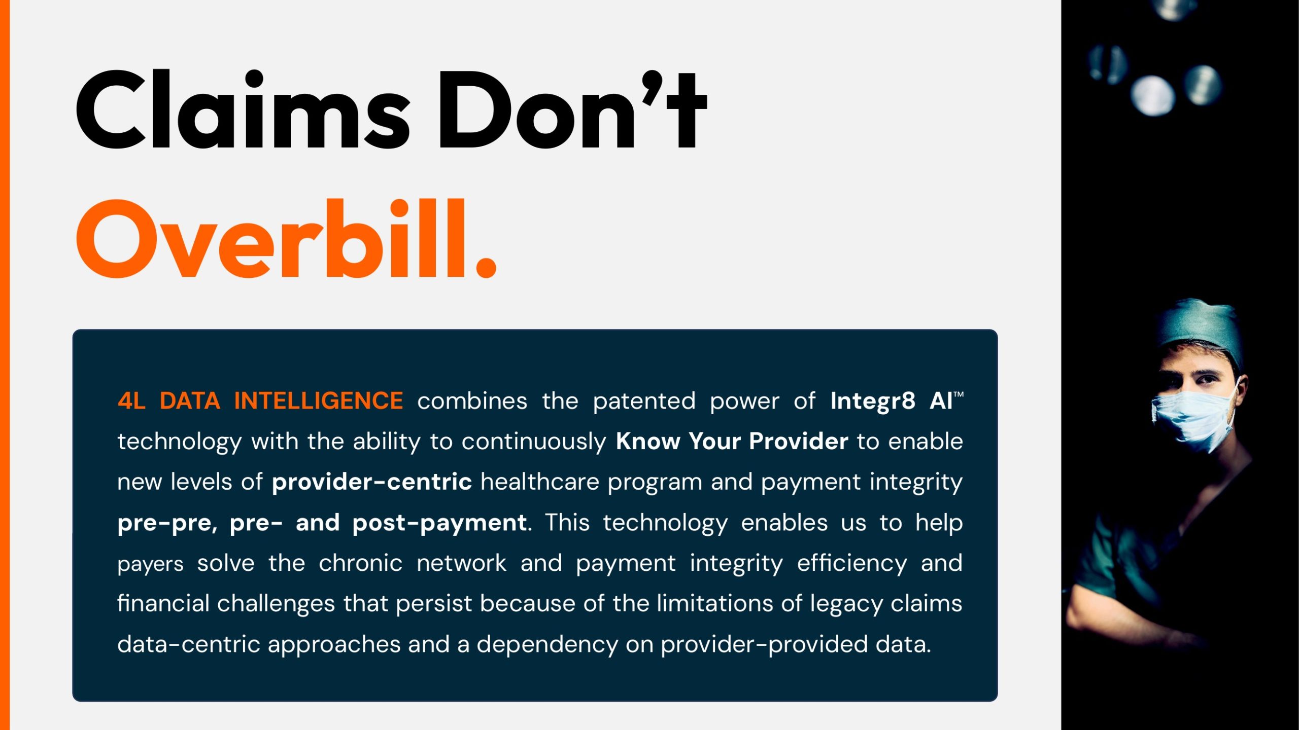
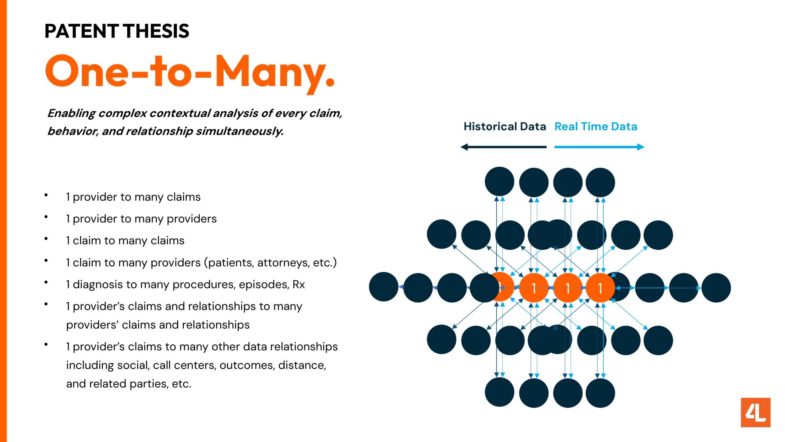
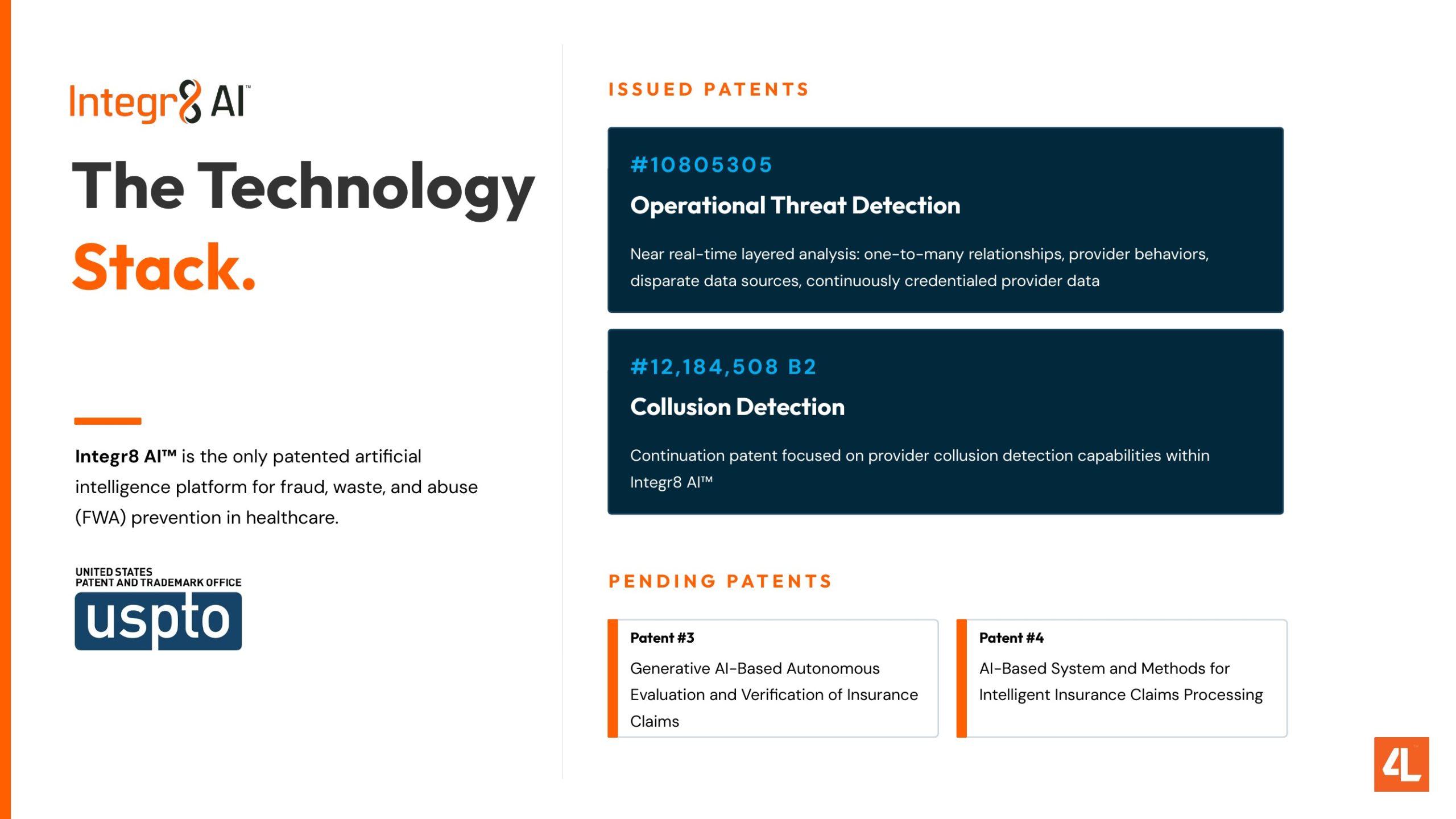
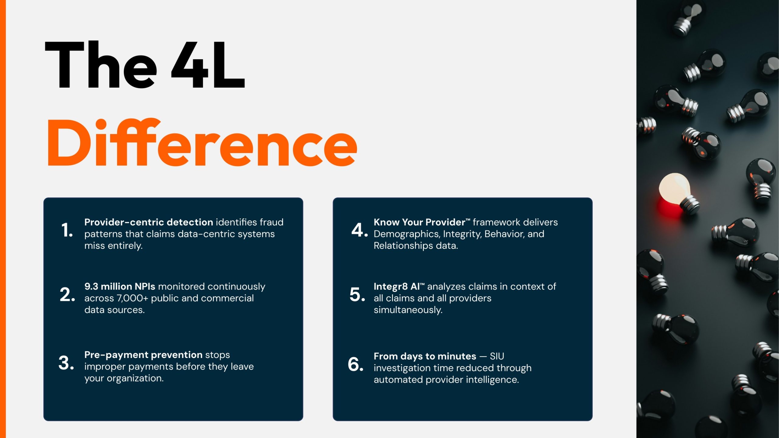
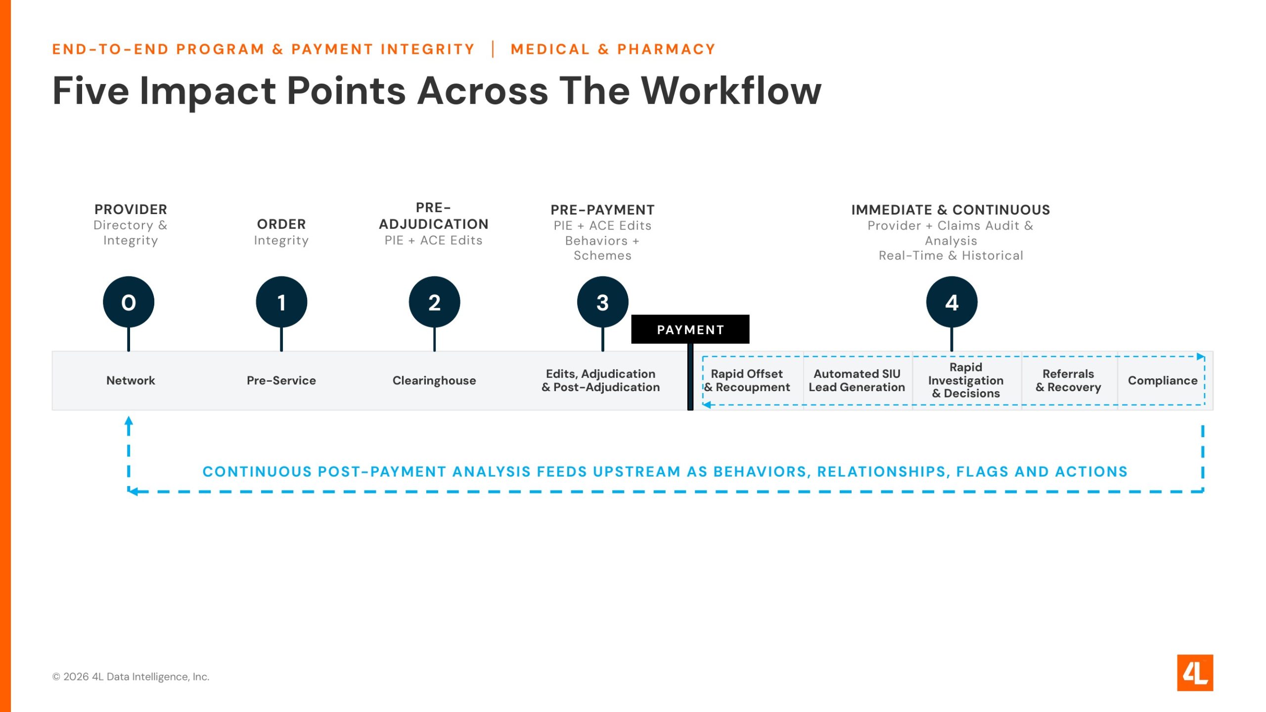
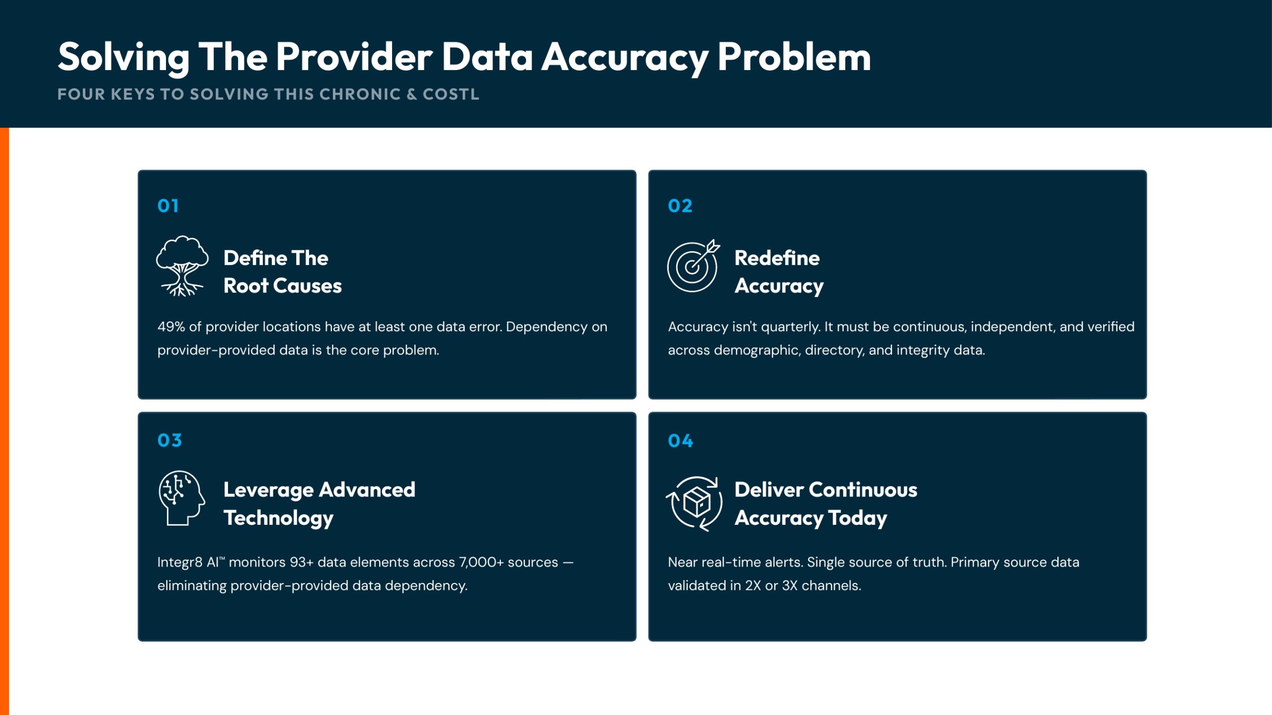
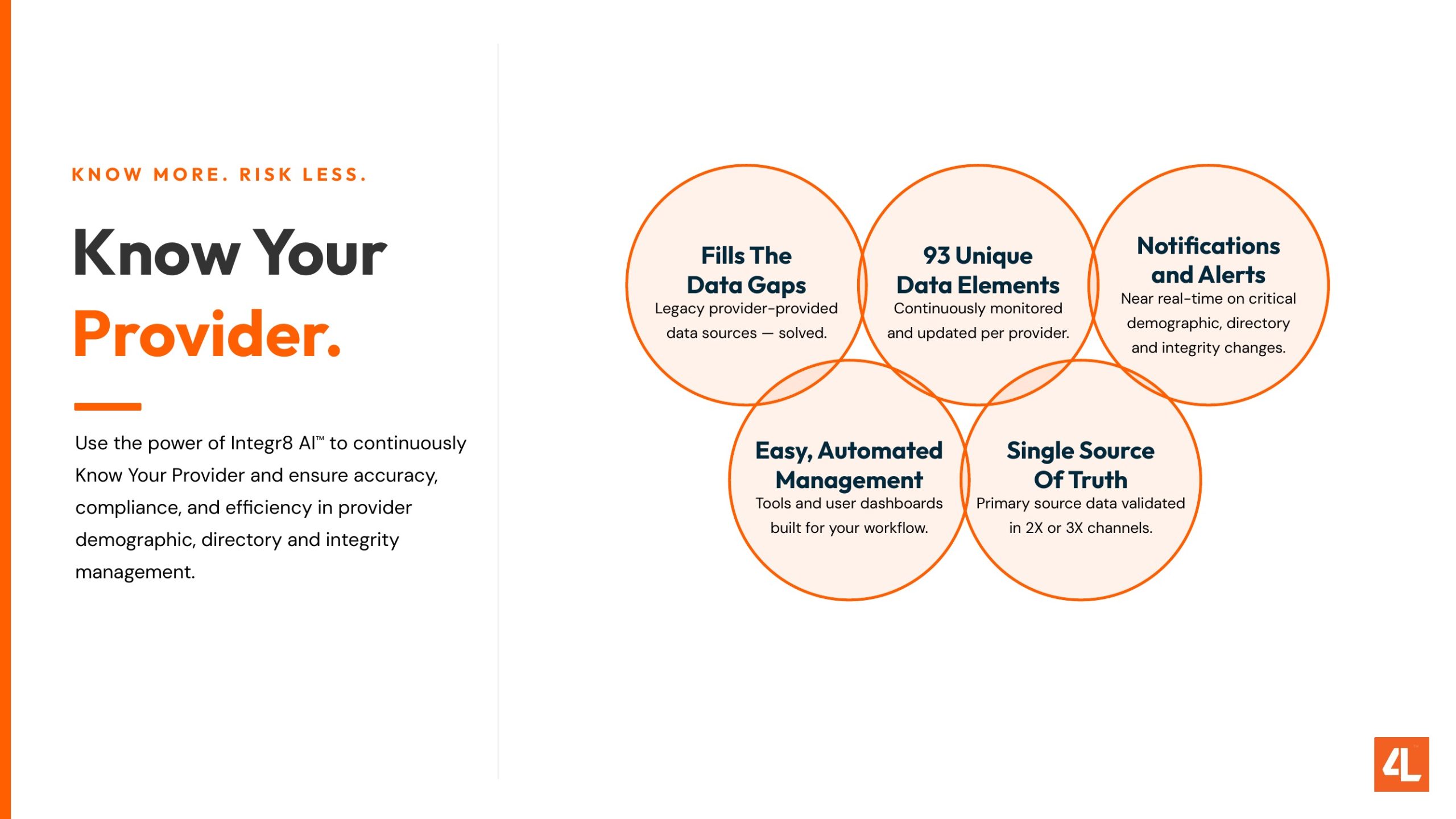
Sixteen slides from the 2026 sales deck and the ROI case studies. Outfit headlines, one accent per claim, the 4L square on every slide.

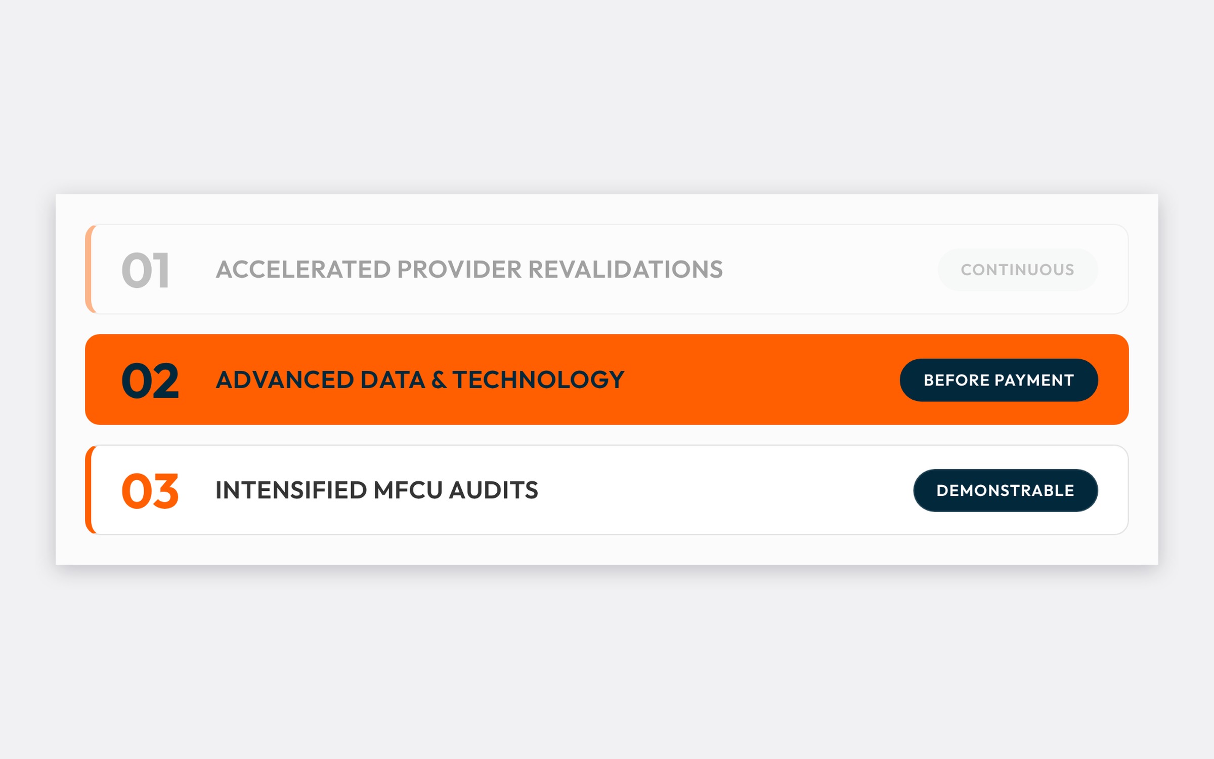
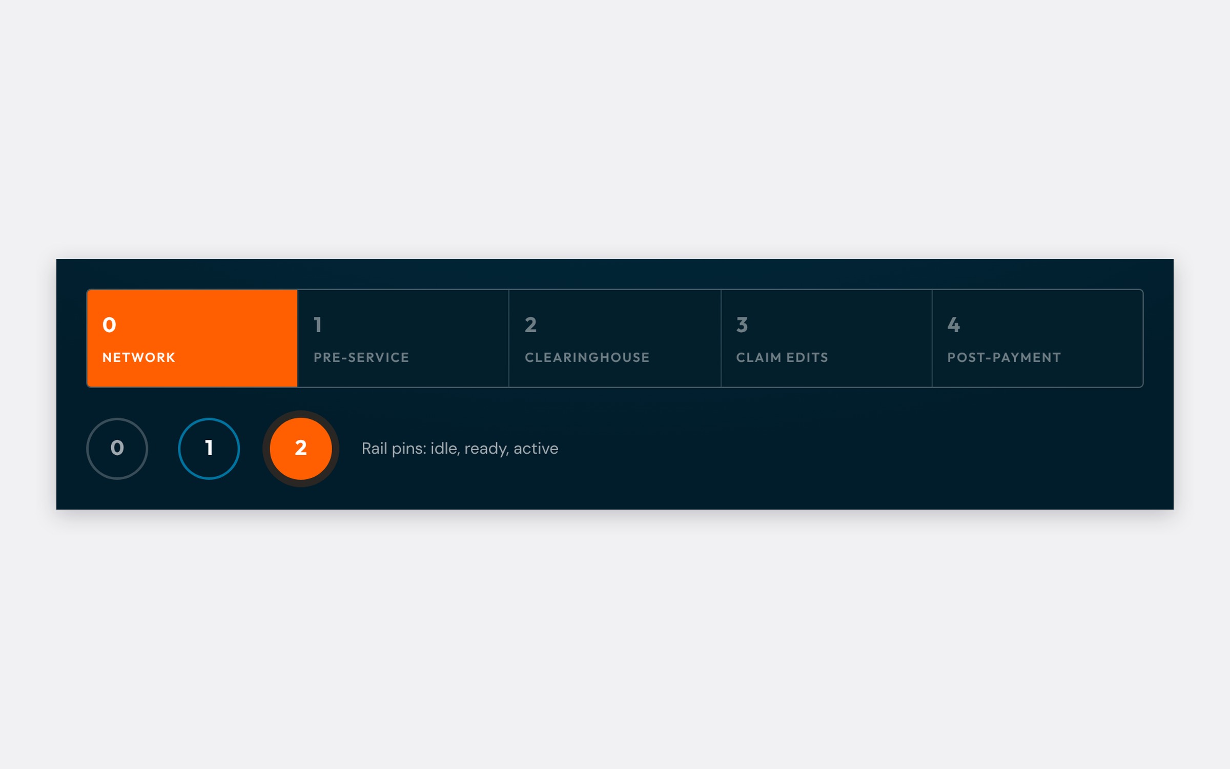
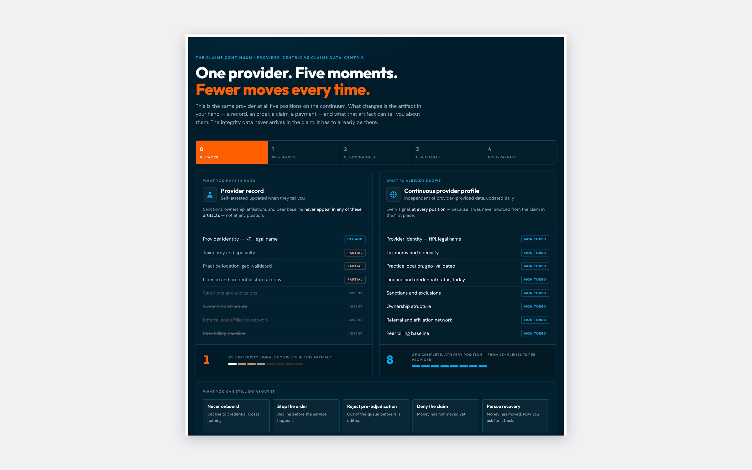
Live, not a screenshot. The Claims Continuum as it runs on the web: pick a point in the workflow and see what 4L stops there. Built in HTML on the same tokens as the decks.

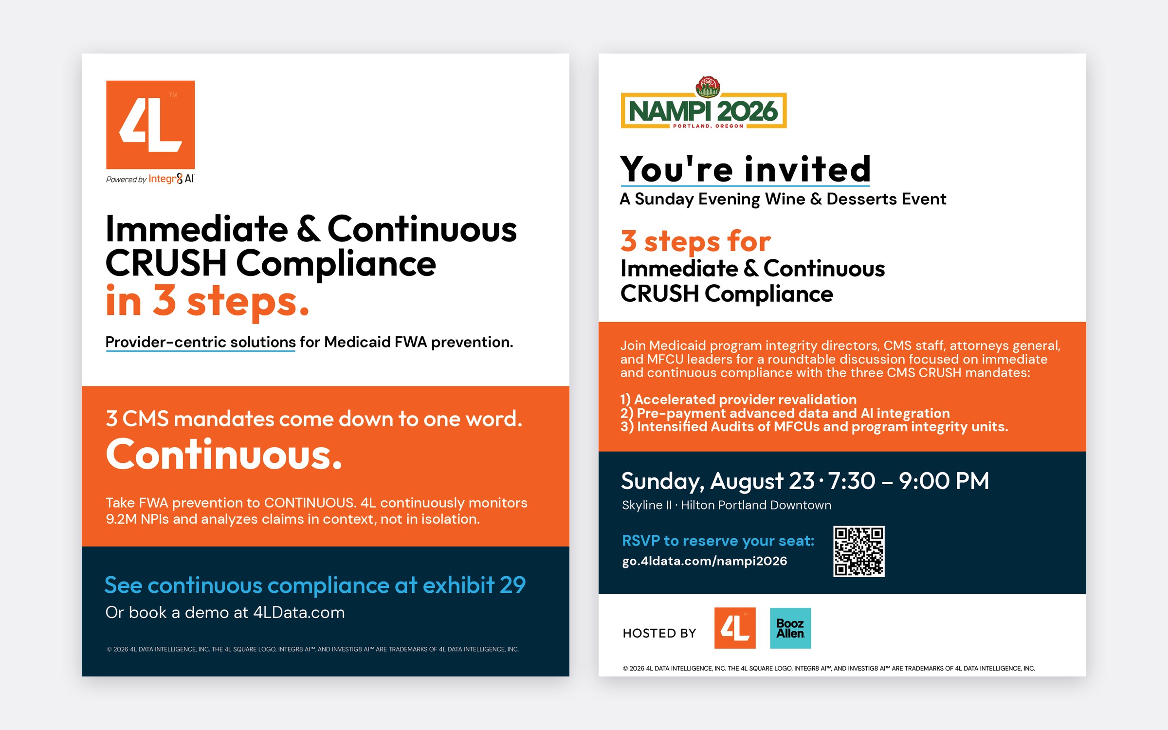
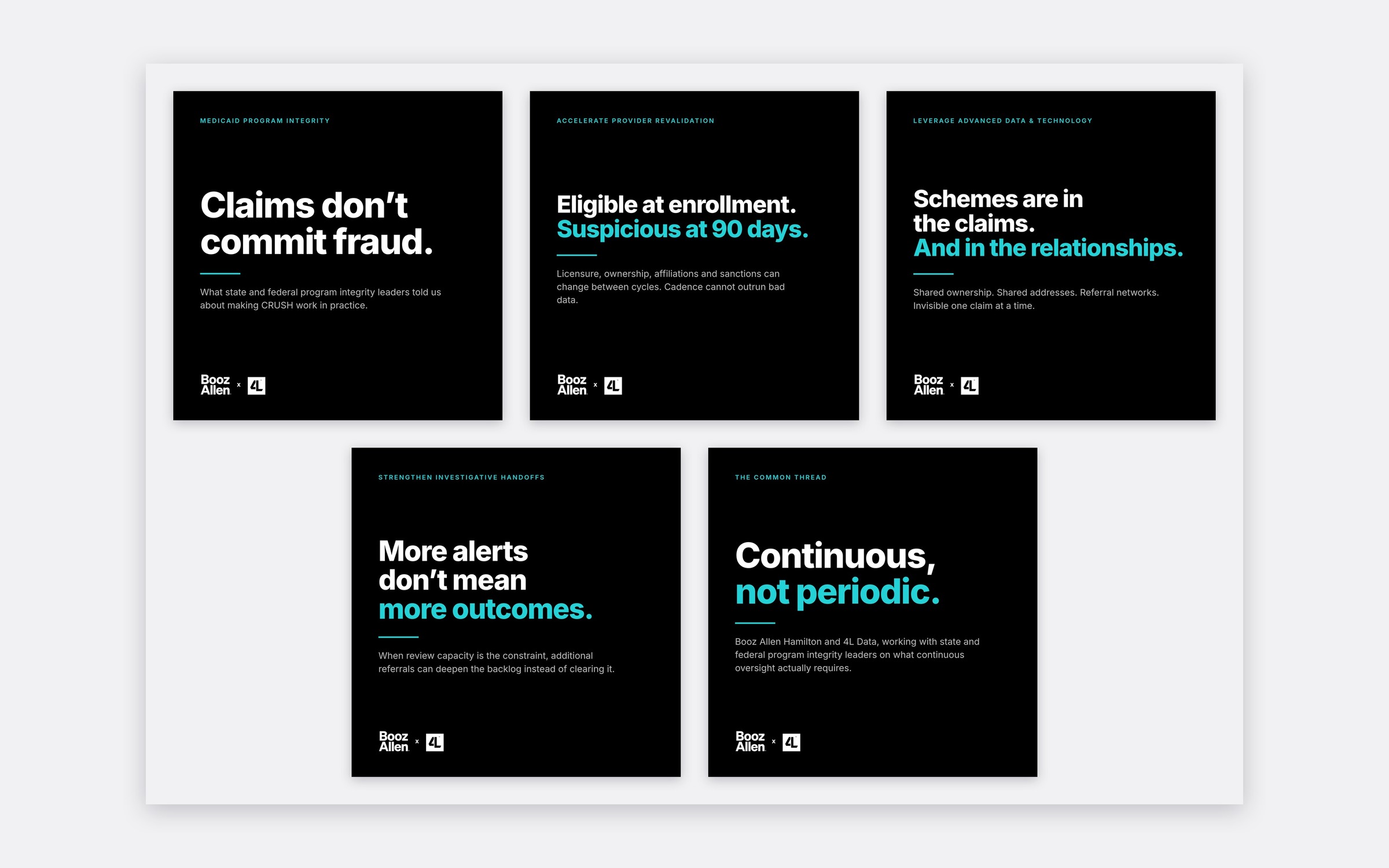
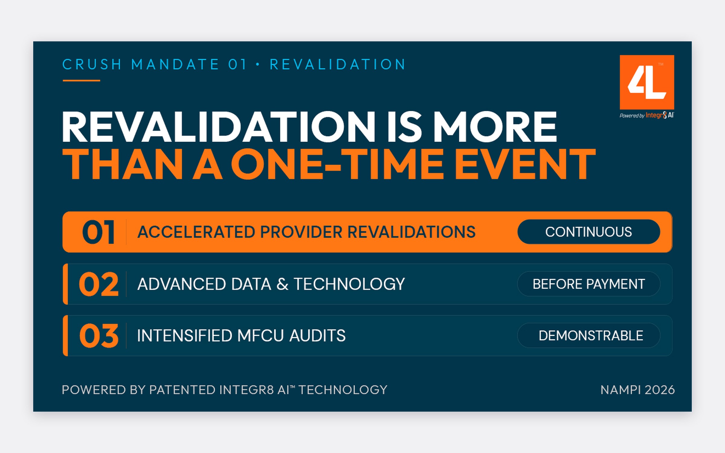
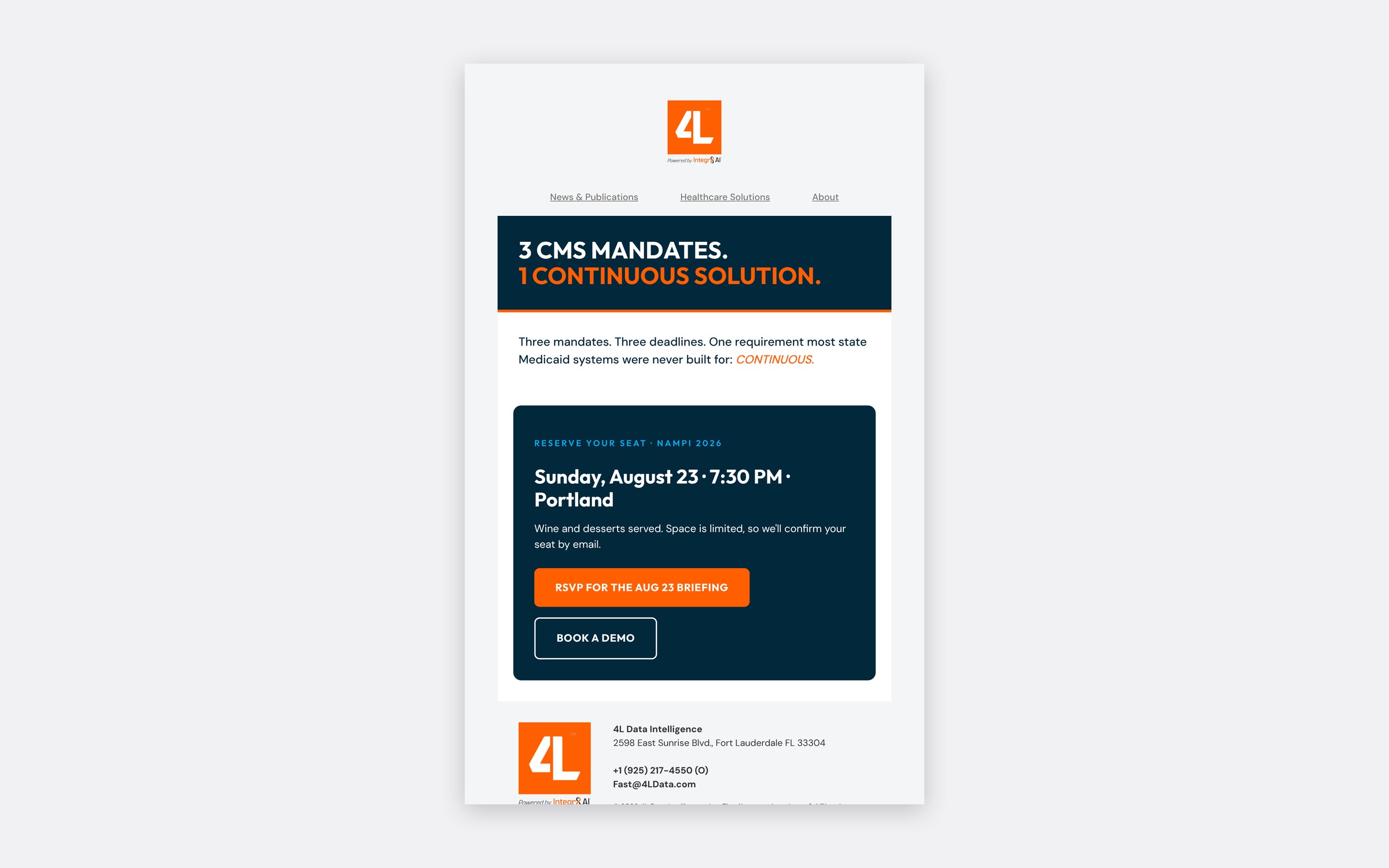
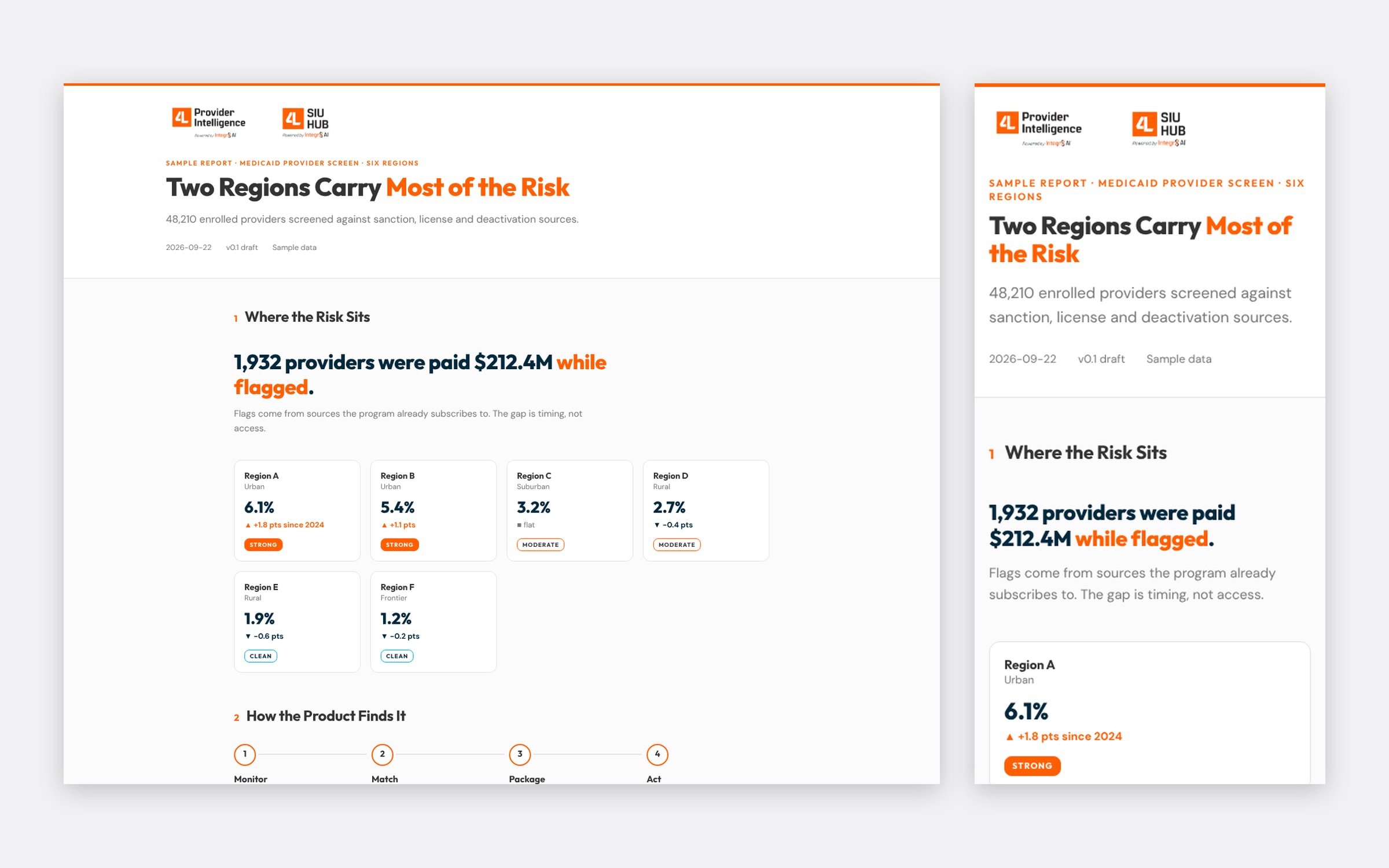
The system in use: NAMPI print, the Booz Allen co-brand, social, design-system components, the email shell and client reports.

Back