Branding Design Art Direction January 1, 2022

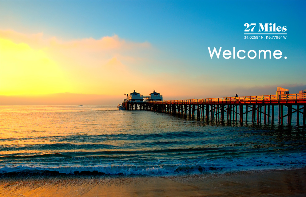
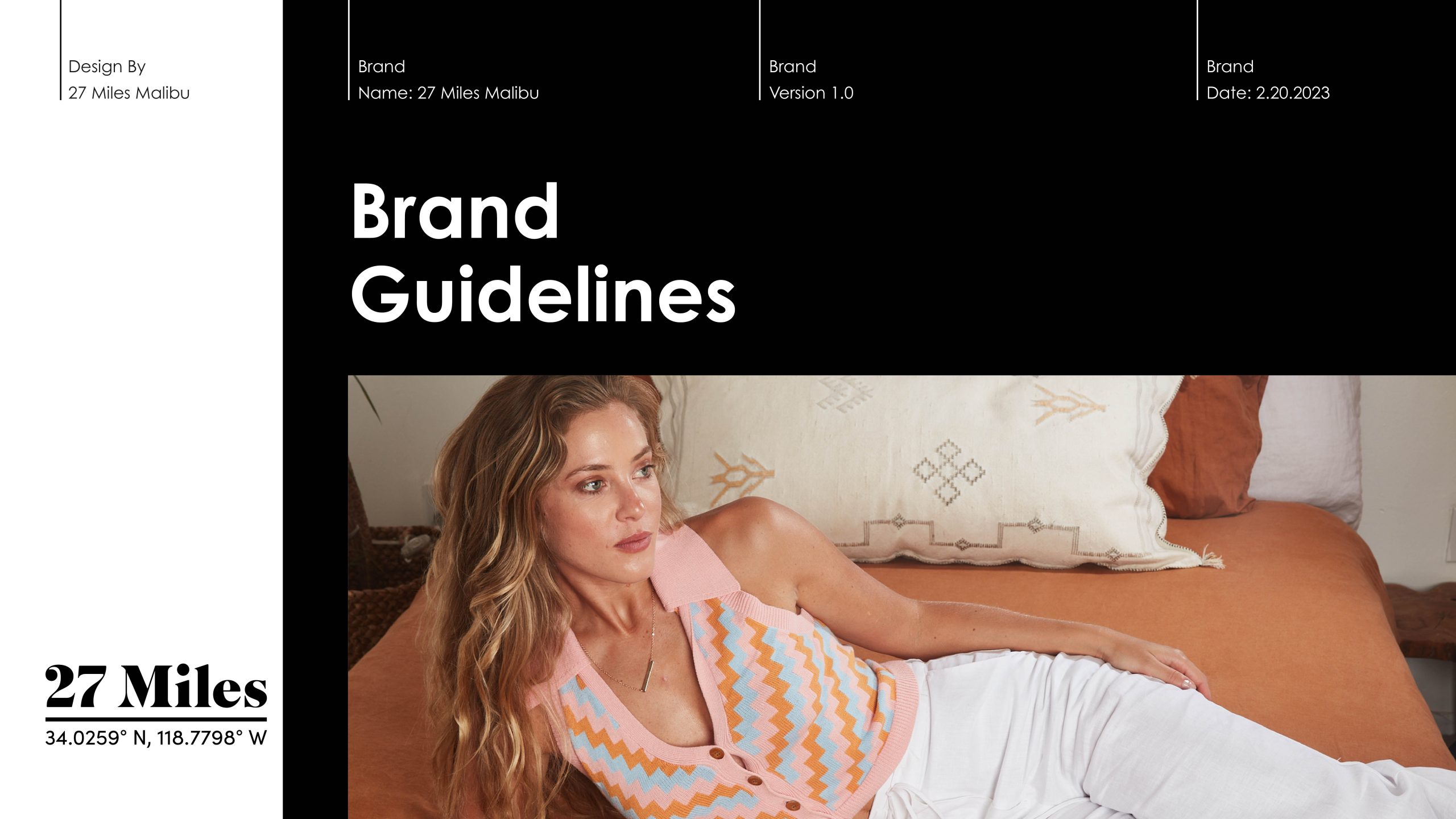
27 Miles Malibu Brand Guidelines

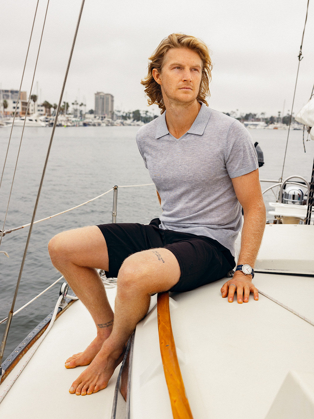
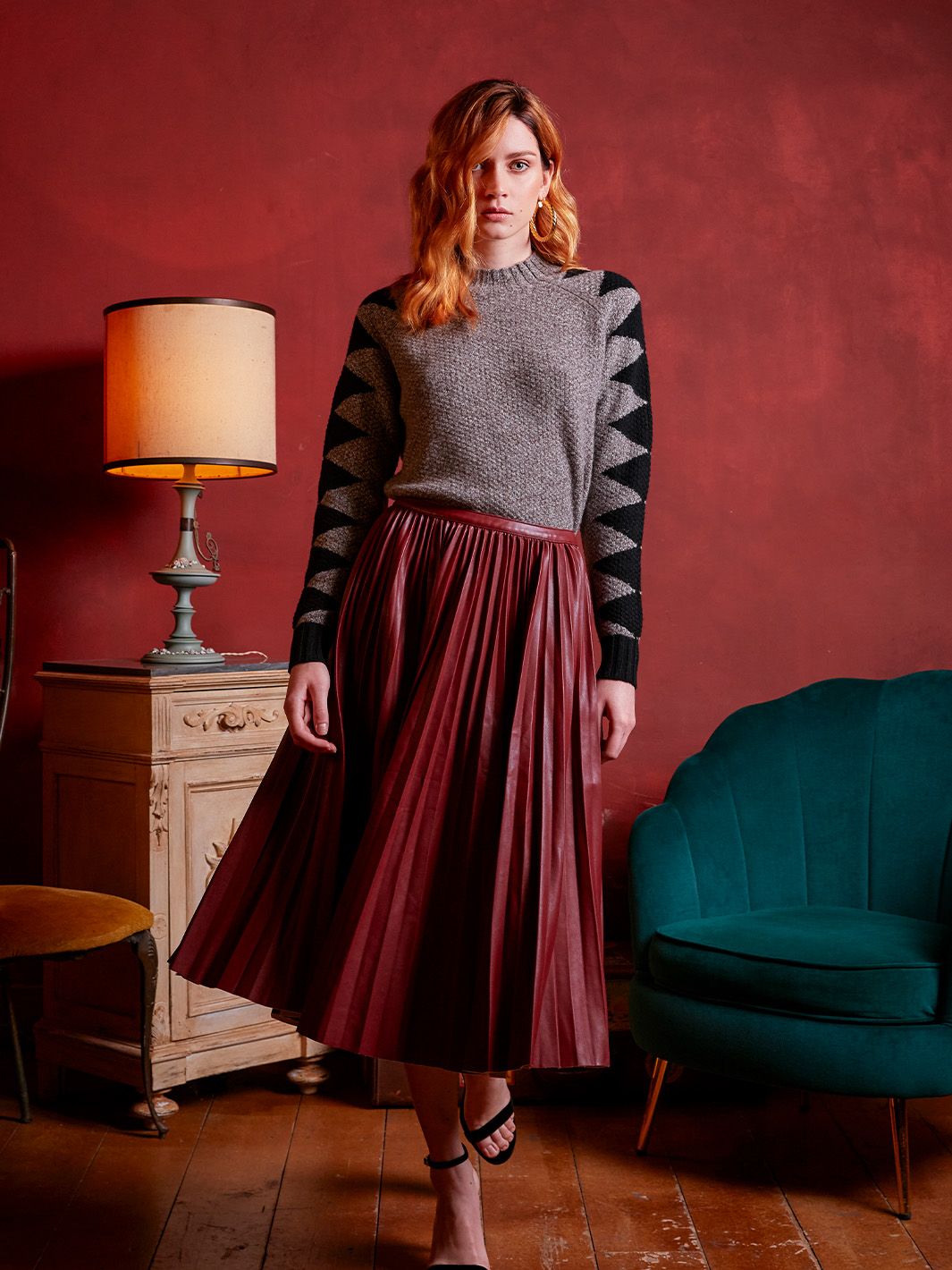
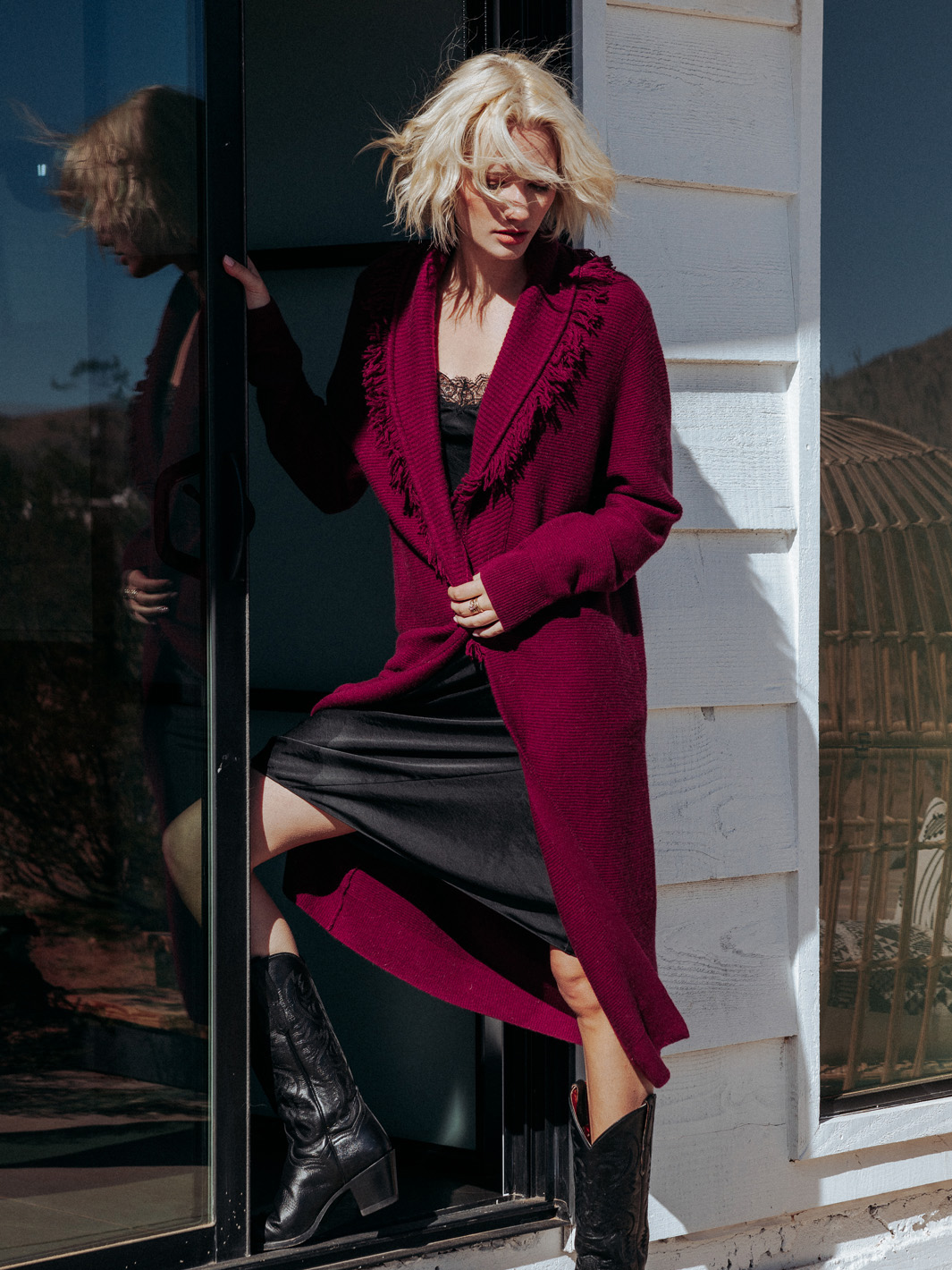
This brand guide conception and creation defined key aspects, such as selecting a suitable color palette, font study, editorial and e-com imagery standards, providing clear logo usage and placement guidelines, and offering recommendations for maintaining brand consistency across various mediums and teams. Providing this guideline established a cohesive and recognizable brand identity that resonated with the audience to foster trust and recognition.

Task

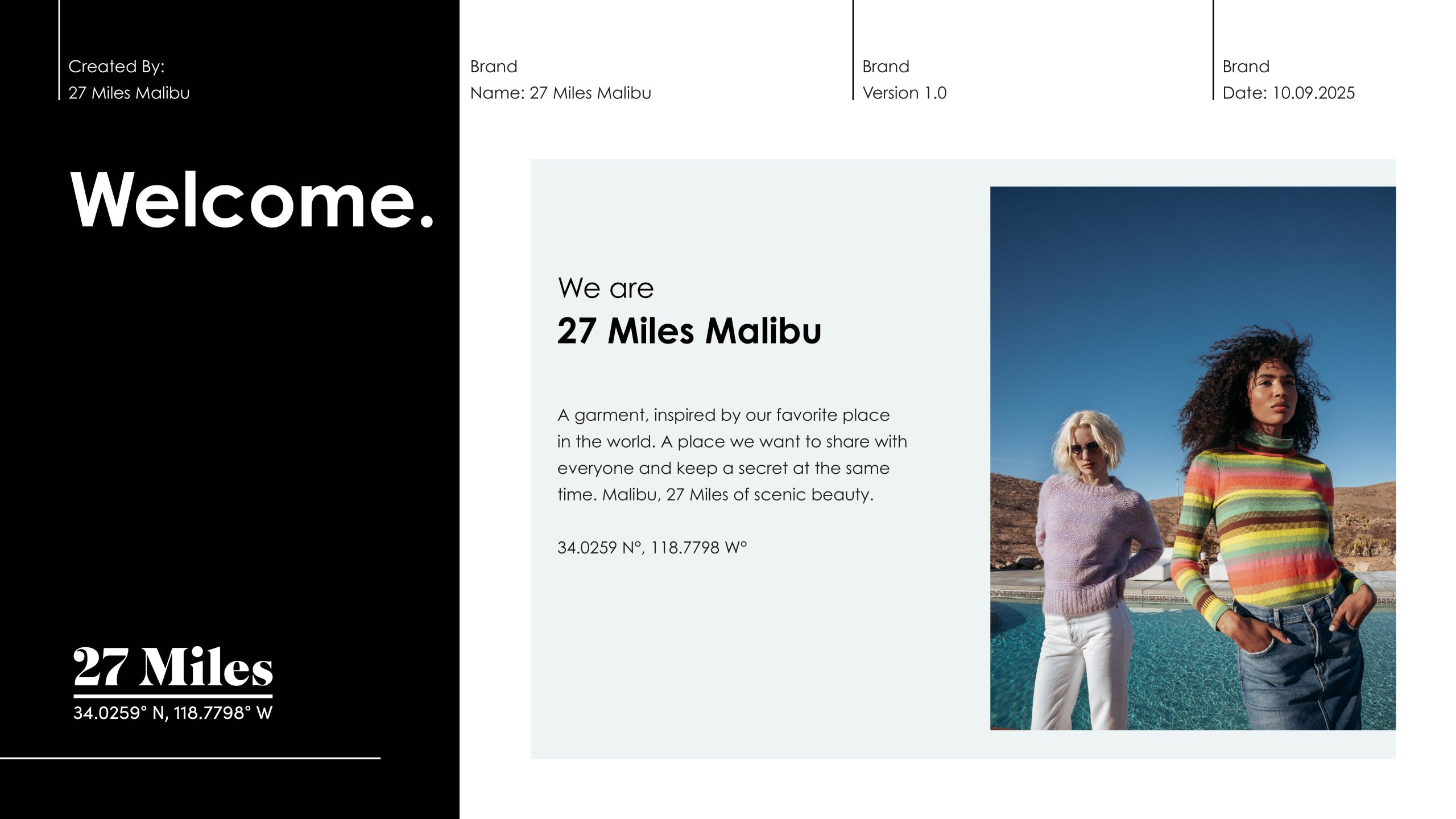
Create a comprehensive brand guideline for 27 Miles Malibu, a high-end fashion brand known for its coastal-chic aesthetic, ensuring brand consistency across all platforms.

  • Strategy

    Brand Strategy

  • Design

    Design, Art Direction

  • Client

    27 Miles Malibu

Welcome

ABOUT OUR Brand

Inspired by 27 Miles of Scenic Beauty. Grounded in the rocks of first-point and lost in the winding trails of the Santa Monica Mountains. We wine and dine in local restuarants, and when we travel, we carry this with us in our soul, material and immaterial.

A garment, inspired by our favorite place in the world. A place we want to share with everyone and keep a secret at the same time. Malibu, 27 Miles of scenic beauty.

34.0259 N°, 118.7798 W°

Brand Identity

the
coordinates

Esoteric in nature, the coordinates reflect the iconic 27 Miles of Scenic Beauty that our brand is rooted in. 27 Miles acknowledges the original inorporated city limits length of the Malibu coast spanning from Tuna Canyon on the southeast to Point Mugu in Ventura County on the northwest. Often referred to as “Bu” or “The Bu” by locals, Malibu is steeped ripe with history dating back to the pre-colonized Chumash Indians. Malibu is a way of living, a way of being. A playground preserved, and no geographical place is closer to our heart. We use these coordinates for graphical representation when appropriate.

03. Color Palette

Unveiling Our
bold
Color Palette.

The two primary colors of 27 Miles Malibu are Black and White. As with our logo, we rely on these two primary colors for brand recogniton. Black and white are independently bold, blending and combining is not authorized.

Ice-Blue is a tertiary color to be used sparingly. Use case would be for graphic elements, in vector overlay on photography, and to support the main primary colors of the brand, Black and White.

Primary Color

Black

CMYK: 000000
RGB : 000000
HEX : 000000
Primary Color

White

CMYK: ffffff
RGB : 255/255/255
HEX : ffffff
Secondary Color

Ice-Blue

CMYK: 33/15/14/0
RGB : 170/193/204
HEX : #AAC1CC
Secondary Color

Ice-Blue

Flexibility is within the opacity of the original pantone.
Branding

Brand Guideline Deck

Some sample pages from the 27MM Brand Guideline deck I designed and wrote copy for with approval from key stakeholders including CEO and President.

Back